


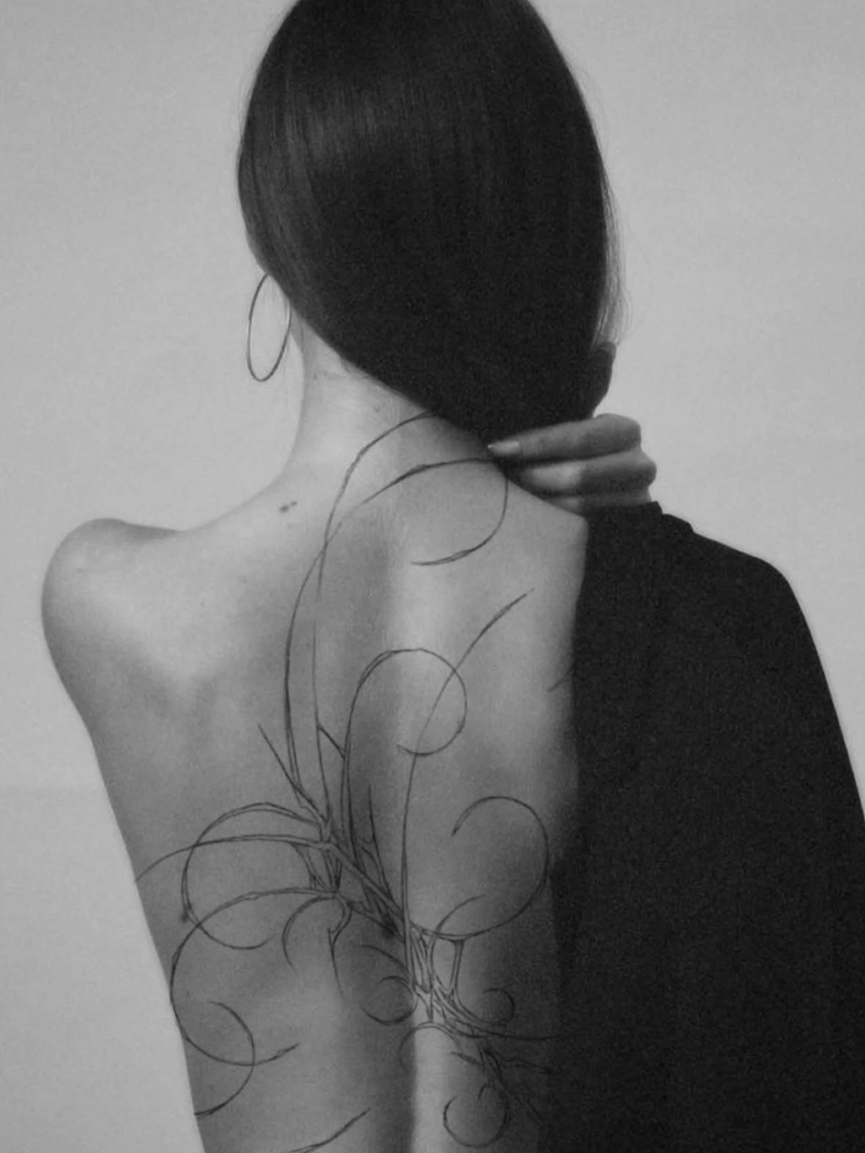
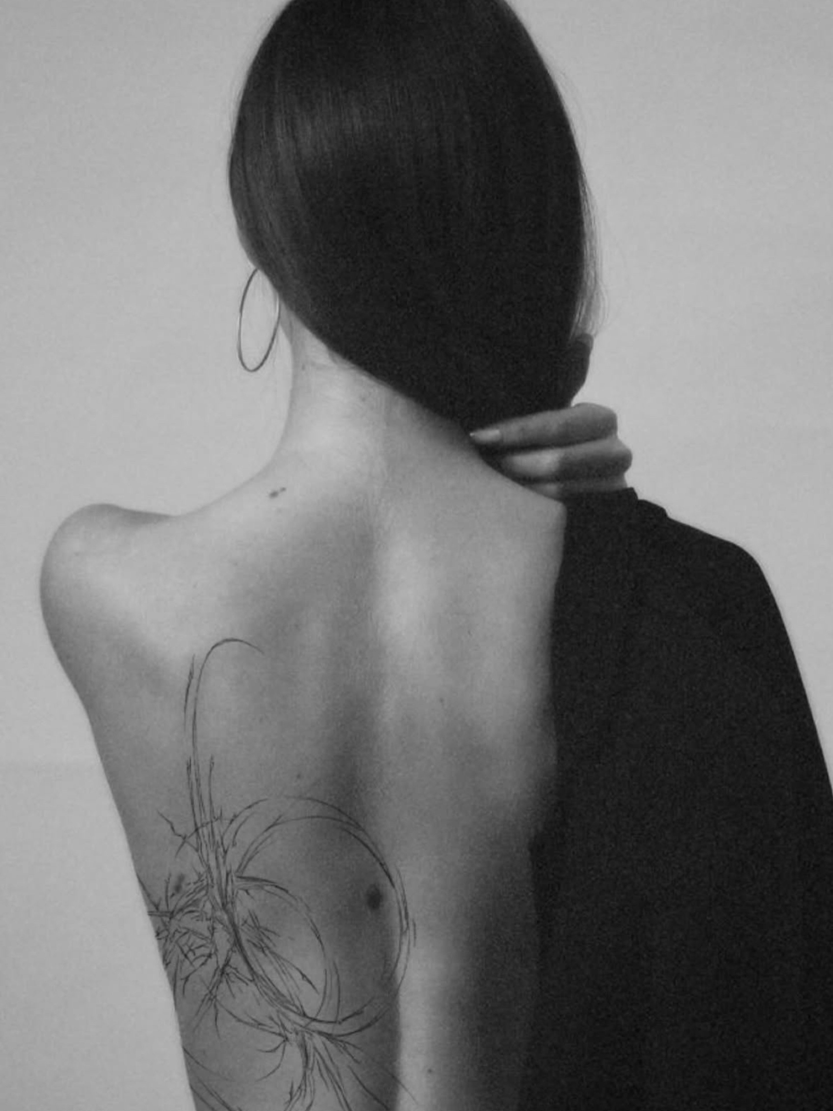


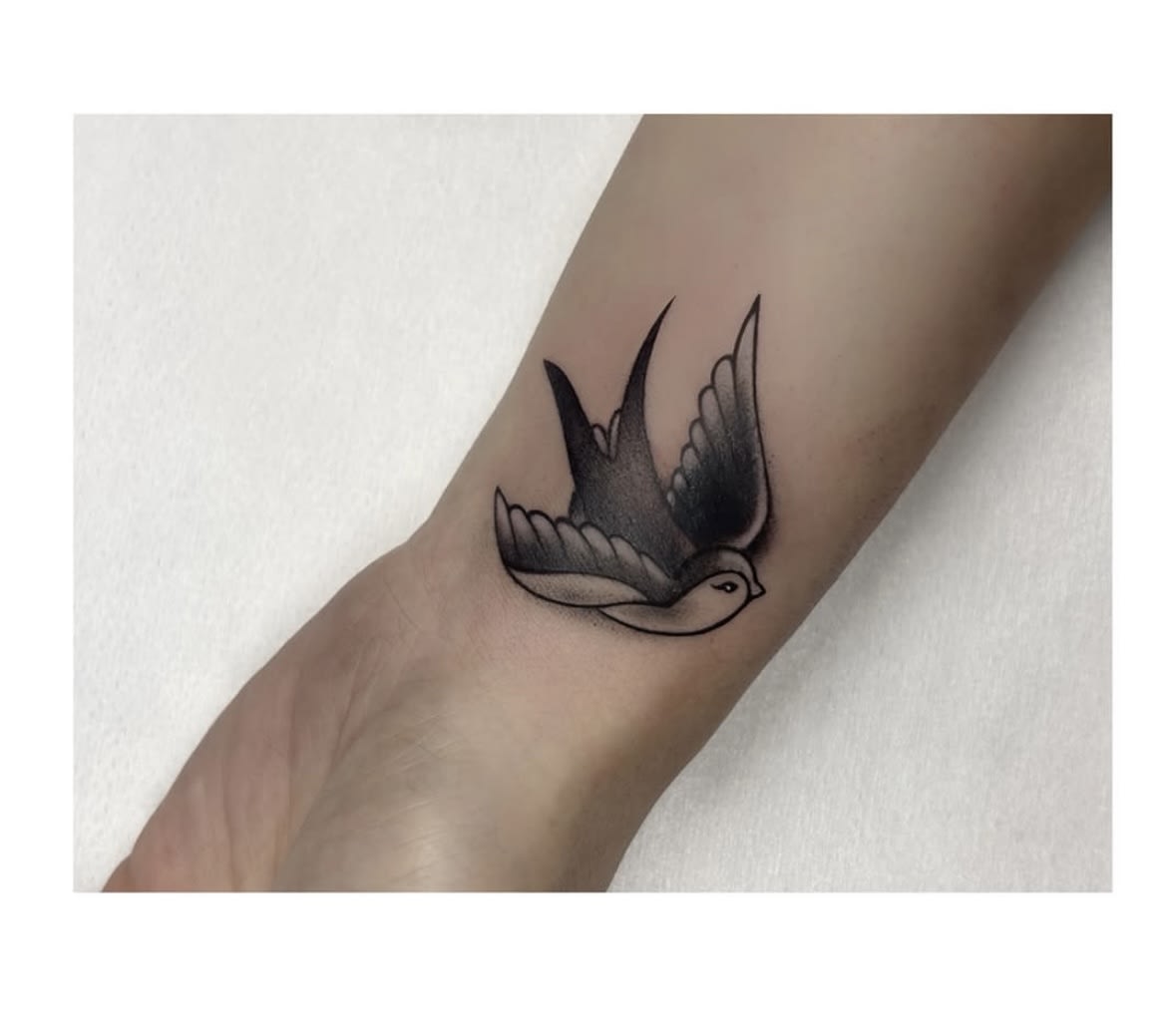
Cover-up — a second life for your tattoo
We cover old or unloved tattoos with a new design. See before-and-after transformations straight from our studio.
Tattoo styles
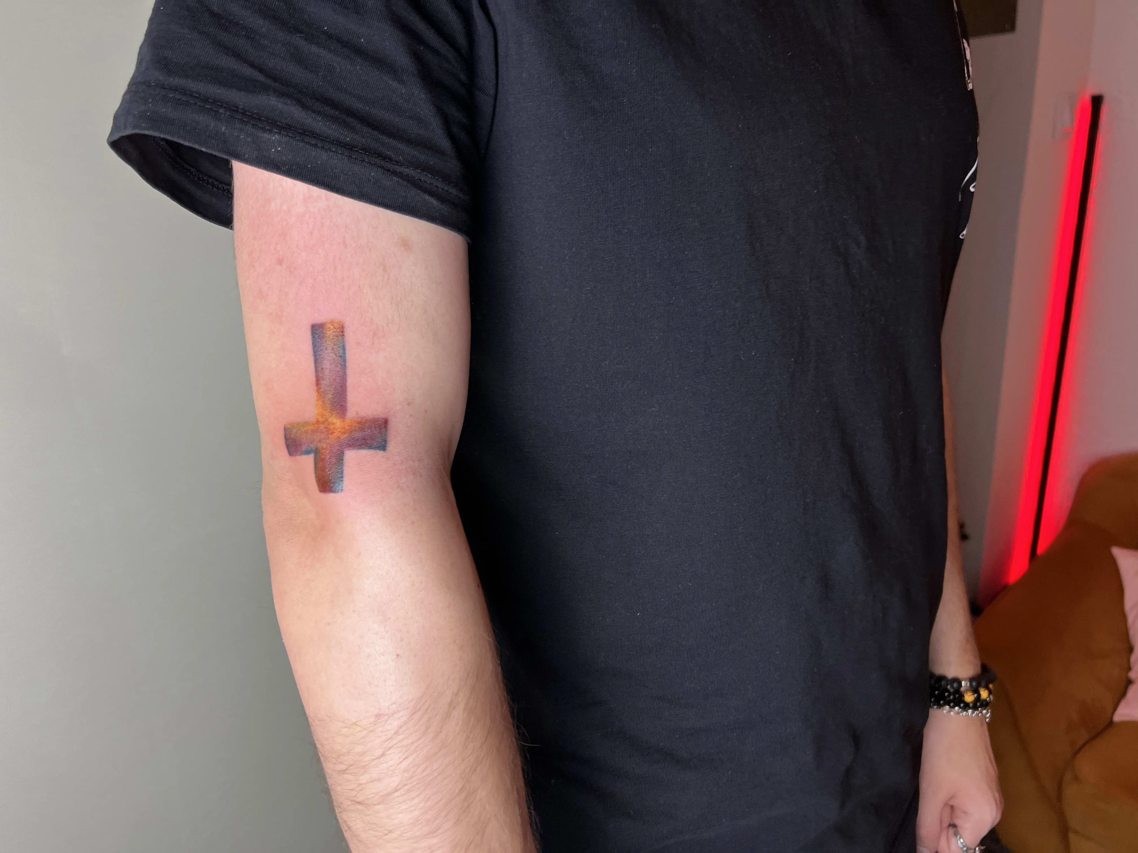
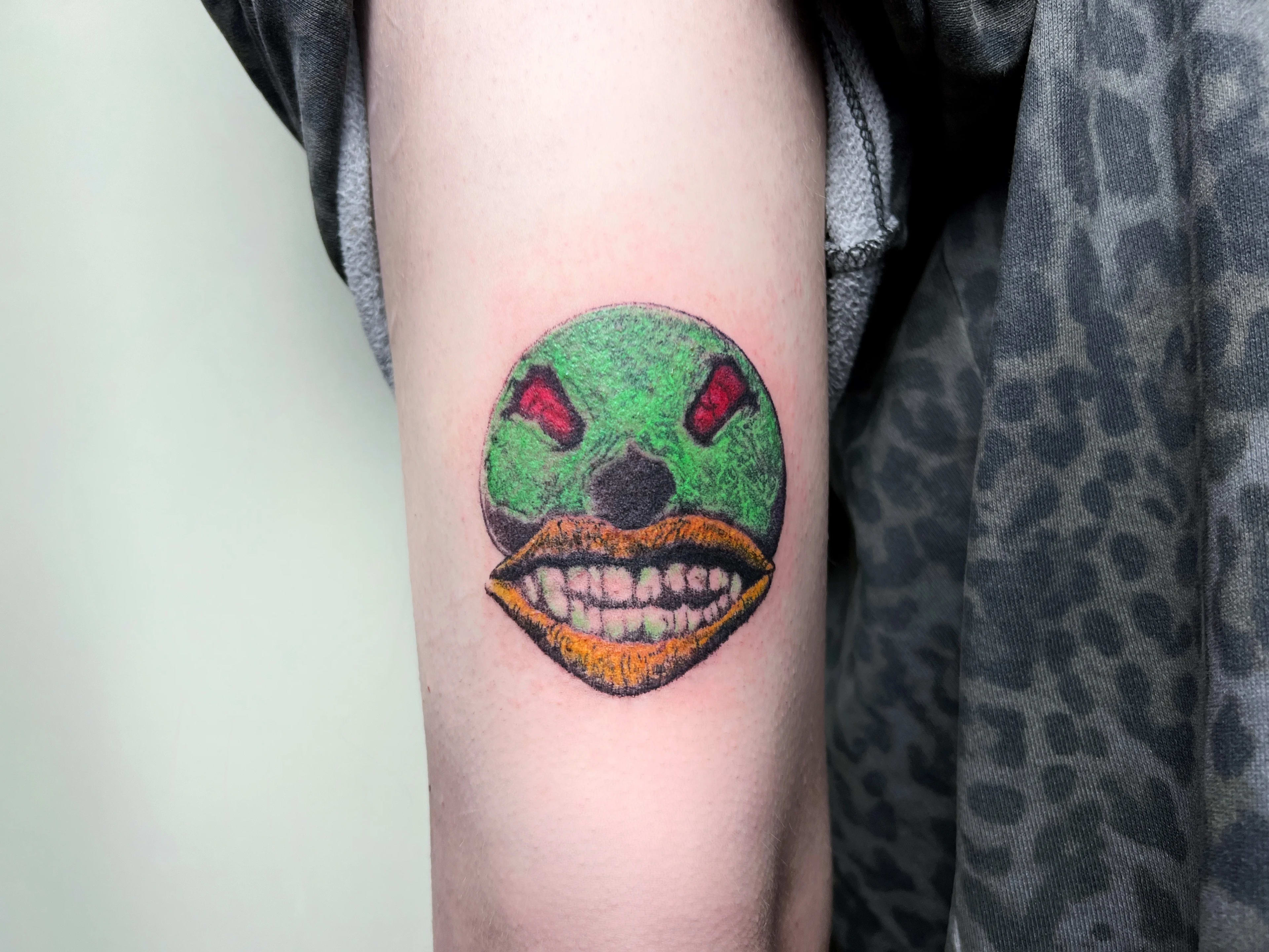
Colour that stays: from painterly watercolour to juicy new school and neo-traditional fills. Palettes matched to your skin tone and designed to last for years.
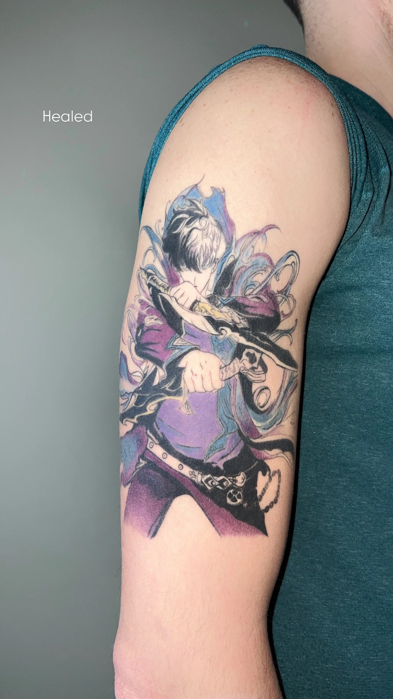
Colour is not one style — it is a whole family of languages: blurred watercolour, cartoonish new school, elegant neo-traditional, illustration, anime. One thing unites them: well-laid colour does things on skin that black simply cannot — it glows, plays with light and catches the eye from across the room.
At our Wrocław studio we take colour seriously: we match the palette to your skin tone, design the contrast so the piece will not merge over time, and honestly tell you which hues hold for a decade and which like to remind you about a touch-up visit. The result: a tattoo that looks alive long after it is fresh.
In this guide we take colour apart: from the history of the tattoo palette, through colour theory on skin and the durability of individual hues, to the multi-session collaboration, pricing and the aftercare that keeps the work juicy for a decade. At the end — answers to the most common questions about colour, skin tone and cover-ups.
Watercolour means soft washes and drips as if from a brush — a tattoo that looks like a painting. New school plays with thick outlines, caricature energy and neon combinations straight out of cartoons and graffiti. Neo-traditional takes old school''s readability and bold line, then adds a modern palette, depth and detail.
Then there are illustration and anime — the colours of a frame carried straight onto skin. You do not need to know the genre names: bring references and we will name what you like and match the convention to your idea.
Skin is not paper: it has its own undertone — warm, cool or olive — that shines through the pigment. The same green can look completely different on two people, which is why we pick palettes only after seeing your skin in person, not from a catalogue.
Colour works on darker skin tones too — we then go for saturated, high-contrast hues and a stronger outline skeleton, and honestly advise against pale pastels. At the consultation we will show which tones will sing on you.
A quick cheat sheet of pigment durability:
The myth says „watercolour vanishes within a year”. The truth: well-made watercolour has a skeleton underneath — an outline or a stronger tonal base — for the painterly washes to lean on. That structure holds the composition for years.
A pure wash with no structure does soften faster — which is why we design watercolour „with a spine”: brush-like drips and smudges, yes, but always on deliberate construction. Painterly and durable at once.

Saturated colour is built in layers: even packing takes a patient, steady hand. We split larger colour pieces into stages — outline and first fills, then saturation and highlights.
Colour also heals more intensely, because the needle works a larger area, and the final saturation shows only after full healing. For bigger projects we therefore plan a short touch-up session — included in the project, not billed on top.
Healing is the standard regime: a thin layer of ointment, loose clothes, no sun, pools or picking. We described it step by step in the aftercare guide on our blog.
Long-term, colour has one true enemy: UV. SPF 50 in summer plus regular moisturising keep the saturation for years, and after 8–10 years a single refresh session restores the original juiciness.
Colour is the most labour-intensive family of styles, and the quote honestly reflects that. The first factor is layers: saturated colour is built with several passes over the same area, and tonal transitions between hues need patient blending on skin — the same composition in colour simply takes more hours than in black.
The second factor is the palette: work in two or three colours is faster than a full painterly spectrum, and light shades often need underpainting for full saturation. The third is scale and sessions: larger colour pieces are planned in stages — outline and base first, saturation later, with healing breaks.
Rough ranges are in our Pricing; specifics after a free consultation — once we see the references, the spot and talk through the palette.

Colour loves nature: watercolour flowers, birds in flight, butterflies and landscapes framed in geometry are classics that never leave our stations. The second big family is pop culture: anime and game characters, film frames, comic-book new school with a thick outline and juicy palette — fans of Japanese animation should also visit our Anime style page.
The third current is neo-traditional portraits and animals: elegant, illustrative pieces where a restrained, deliberate palette plays first violin — a good choice for people who want colour without comic-book energy.
Whatever the motif, one rule holds: we design colour for a specific skin and a specific spot. The same palette reads differently on different tones — final decisions are made live, at the consultation.
Myth one: „colour disappears after a few years”. Colour fades faster than black, but „faster” means a decade, not a season — given sun protection and good execution. Work that truly faded in two years is almost always a story of beaches without SPF or dubious pigments.
Myth two: „colour makes no sense on darker skin”. It does — it just needs another strategy: a stronger outline, more saturated, contrasting hues and an honest talk about which shades will play. The difference is in palette selection, not in the point of colour.
Myth three: „a colour tattoo needs constant maintenance”. Well-laid colour needs no mandatory upkeep beyond SPF. A refresh after many years is an option, not a necessity — and a single session, not a rebuild.
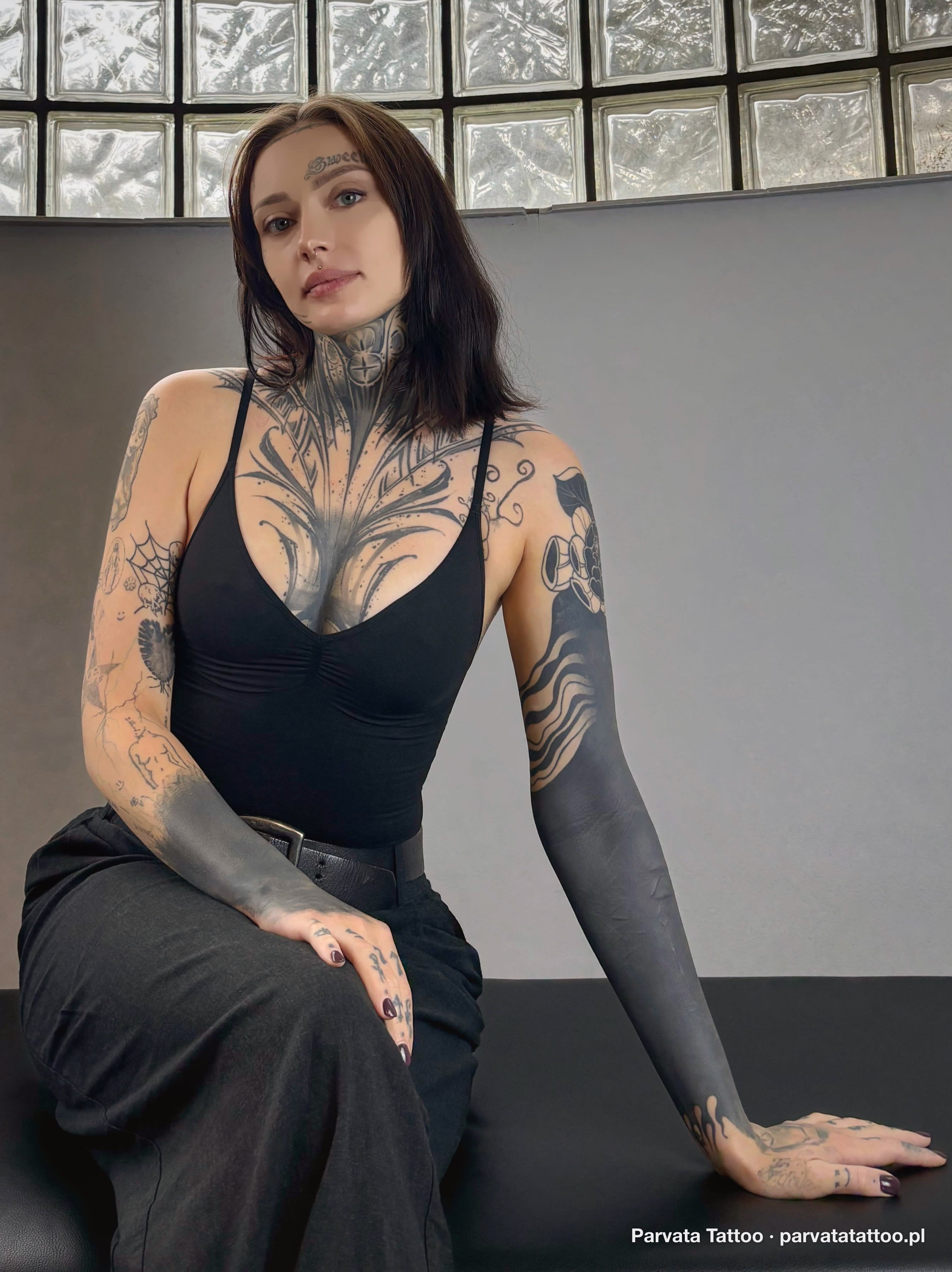
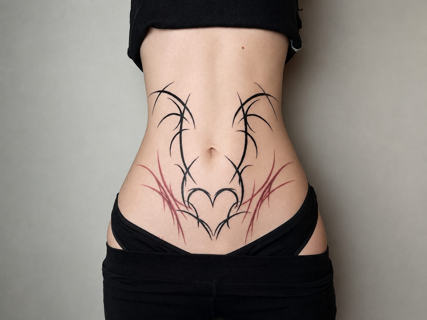
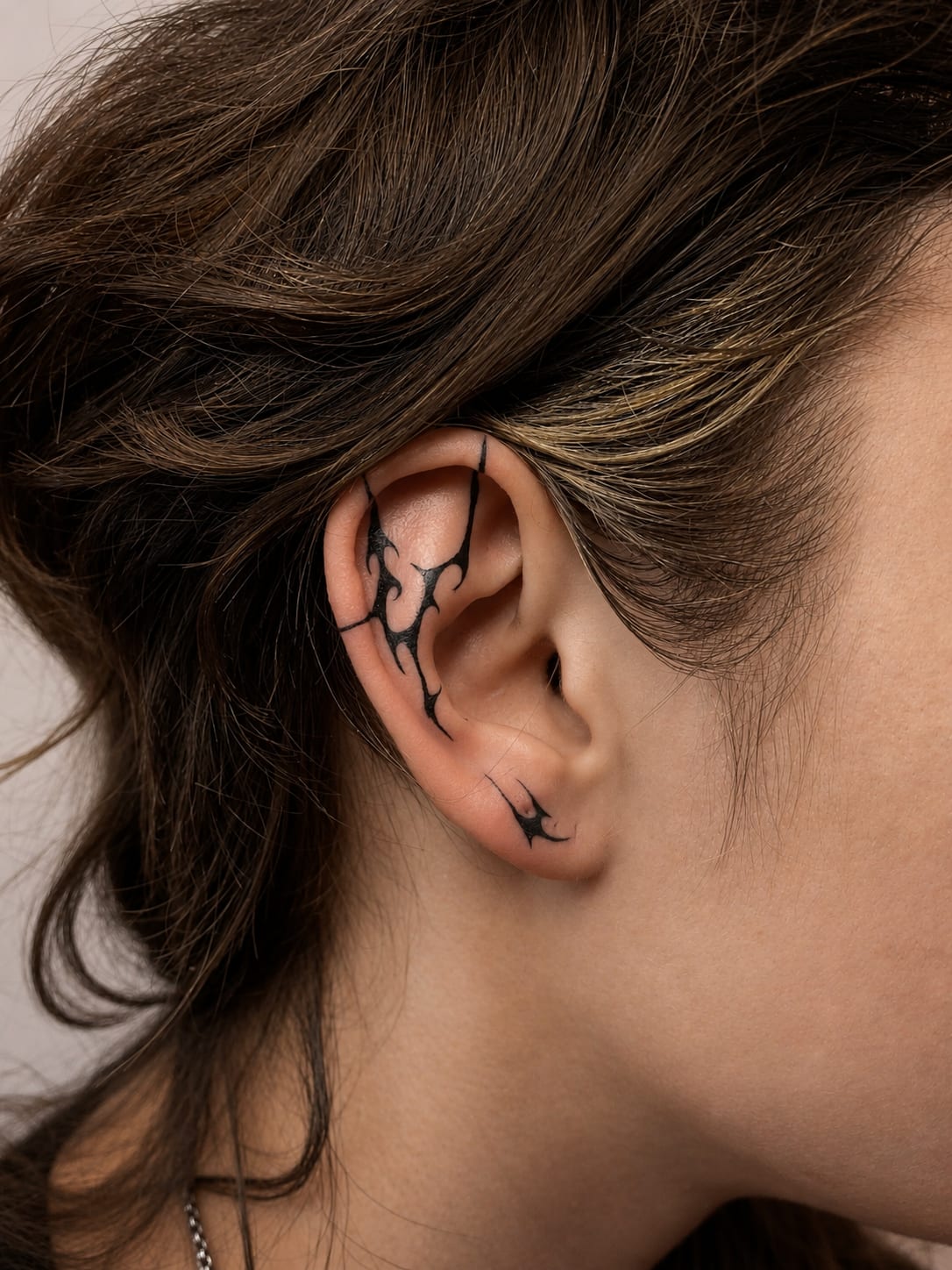
Colour is one of the strongest cover-up tools: a deliberate, saturated composition can completely hide an old, failed tattoo while delivering a piece that looks planned from the start. Flowers, birds and painterly patches are especially graceful here — their organic shapes naturally camouflage old outlines.
Physics is only partly on our side: new pigment does not paint over the old like a wall — it overlays it optically. Dark, dense old work sometimes needs laser lightening first; usually two–three sessions open up the design's room for manoeuvre.
Every cover-up starts with a photo of the old piece — on that basis we say honestly what can be done right away and what after laser. More before-and-after examples are on our Cover Up page; send a photo through the form, the assessment is free.
Colour in tattooing started modestly: classic sailor old school had literally a few pigments — red, green, yellow — and its aesthetic was born from that constraint: simple, strong patches of colour in a thick black outline, designed to survive decades on a sailor's skin. Many did — a humility lesson for the whole trade.
The revolution came with pigment chemistry: modern certified inks offer hundreds of stable shades, and machines allow painterly tonal transitions old school could only dream of. On that foundation grew new school with its comic-book energy, elegant neo-traditional, and finally watercolour — a current that deliberately abandoned the outline for the painterly patch.
Each current balances outline and colour differently, but all use the same modern knowledge: how to build saturation in layers, how to design contrast so the piece does not blur with time, and which pigments can honestly be promised for decades. At our studio we move across this whole spectrum — at the consultation we will help find the current that fits your motif and temperament.

The first story is people whose motif simply lives on colour: the Ghibli fan whose anime sky must be blue; the nature lover whose kingfisher without turquoise would be just a bird. For them the question „colour or not” does not exist — only „how to lay it best”.
The second story is seekers of light: people who stop at watercolour work while browsing a portfolio, because black and grey — however beautiful — feels too serious. Colour gives their skin something black cannot: joy, softness, painterliness. The third story is pragmatists of expansion: owners of black-and-grey collections who want to breathe new life into them — a single colour accent can reorganise a whole composition.
Whatever the story, one thing stays common: colour is a decision for years, so we make it with full knowledge — of palette, skin tone, placement and aftercare. That is what the free consultation is for.
Colour needs the most planning of all styles, so the process starts early. After you send the form we book a consultation where, beyond motif and placement, we talk palette: which hues carry meaning, which will play with your skin tone, and which we will honestly advise against — live, in natural light, not from a chart.
We always show the design of a colour piece before the session, often in two saturation variants. With larger work we also plan the schedule: outline and tonal base first, then saturating colours in layers, with three–four-week healing breaks. We say plainly how many visits are really needed before you book anything.
After each stage you get a second-skin dressing and instructions — healing colour goes through a matte phase we warn about, so there is no panic: full saturation returns after healing. Once the whole is done, we invite you for a check-up and saturate single areas if needed. From then on your role is two things: moisturiser and SPF.
Choose colour when the tattoo should live on light — watercolour transitions, saturated illustration, new school. We match the palette to your skin tone, because the same pigment reads differently on different skin.
We do not promise the colour will look identical in ten years — sun and time do their work. We will tell you straight which shades hold longest and which will ask for a refresh.
Yes, colour ages a little faster than black — but „faster" means years, not months. With SPF and regular moisturising a good piece looks great for over a decade, and a refresh is a single session.
It will — we then choose more saturated, contrasting palettes and a stronger outline, and we will honestly talk you out of shades that would not read (pale pastels, for instance). We always judge the effect live, not from a chart.
Not when it is designed properly. Our watercolour always sits on a structure — an outline or a stronger tonal anchor — so the painterly washes have something to hold on to for years.
The pigment itself makes no difference, but filling means longer work over the same spot, so the session can feel more intense. We split larger pieces into stages and take breaks — it is perfectly manageable.
Often yes — colour plus a well-planned composition is a powerful cover-up tool. Very dark old work sometimes needs laser lightening first. Send a photo or visit our Cover Up page and we will assess it free of charge.
Sleep well, eat a solid meal, hydrate, and moisturise the area for a week before the appointment. Well-moisturised skin takes pigment more evenly — fewer touch-ups, a better final result.
Usually two to four: the first is the outline and the base, the following ones build colour in layers, with three to four week breaks for healing. We set the exact schedule with the design and say it plainly before you book anything.
Yes — colour takes extensions well, as long as the palette stays consistent. We design new elements to share the colour temperature and style of the existing work; then the whole thing looks planned from the start rather than glued on.
Send your idea and references through the form. During the free consultation we look at the placement in natural light, match the palette to your skin tone and set a realistic session plan — from design to full saturation.
There are no magic „for colour" creams — a gentle, fragrance-free lotion for regular moisturising and a proper SPF 50 for the sun are enough. Those two habits, not the price of the product, decide how long the colours stay vivid. We recommend specific products after the session.
Somewhat — less sun and sweat means calmer conditions for fresh colour, which is why we like to schedule large colour projects for the cooler months. We also work with colour in summer without worry, just with stricter protection: shade, loose clothing and a dressing matched to the weather.

Coven of dark elves
Mira Paul • Sacred__kid • Tattoo Artist

Surrealist motif collage
Justyna Góra • Tattoo Artist • Permanent Makeup
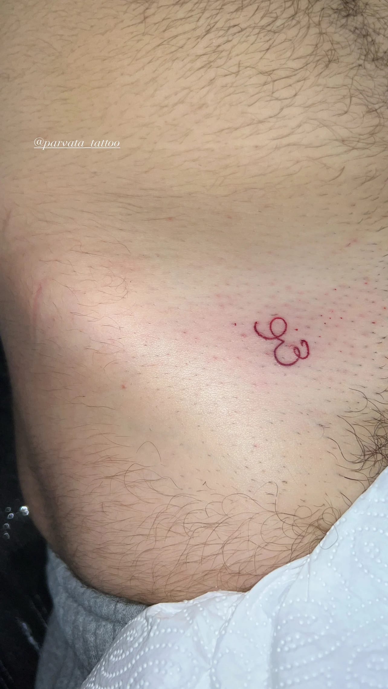
Red numerical monogram
Justyna Góra • Tattoo Artist • Permanent Makeup
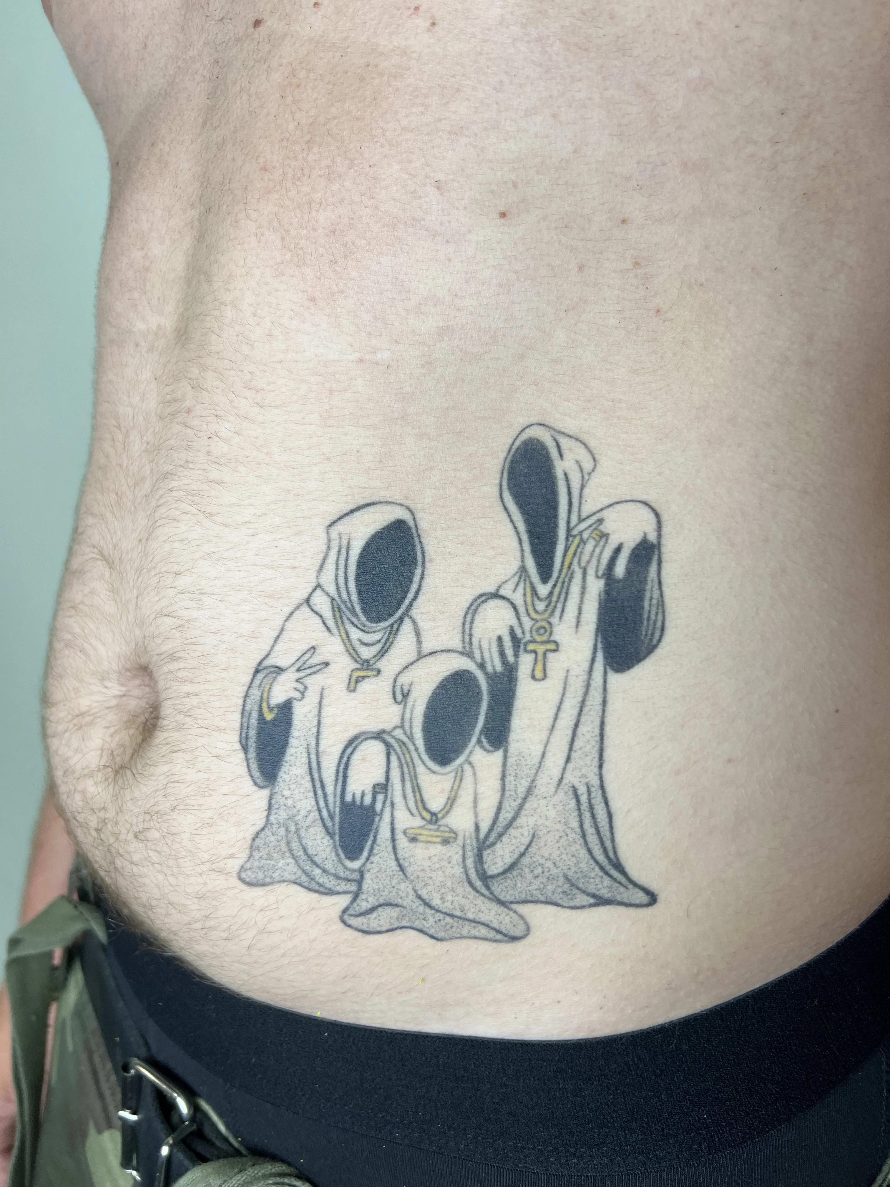
Hooded figures in gold chains
Justyna Góra • Tattoo Artist • Permanent Makeup
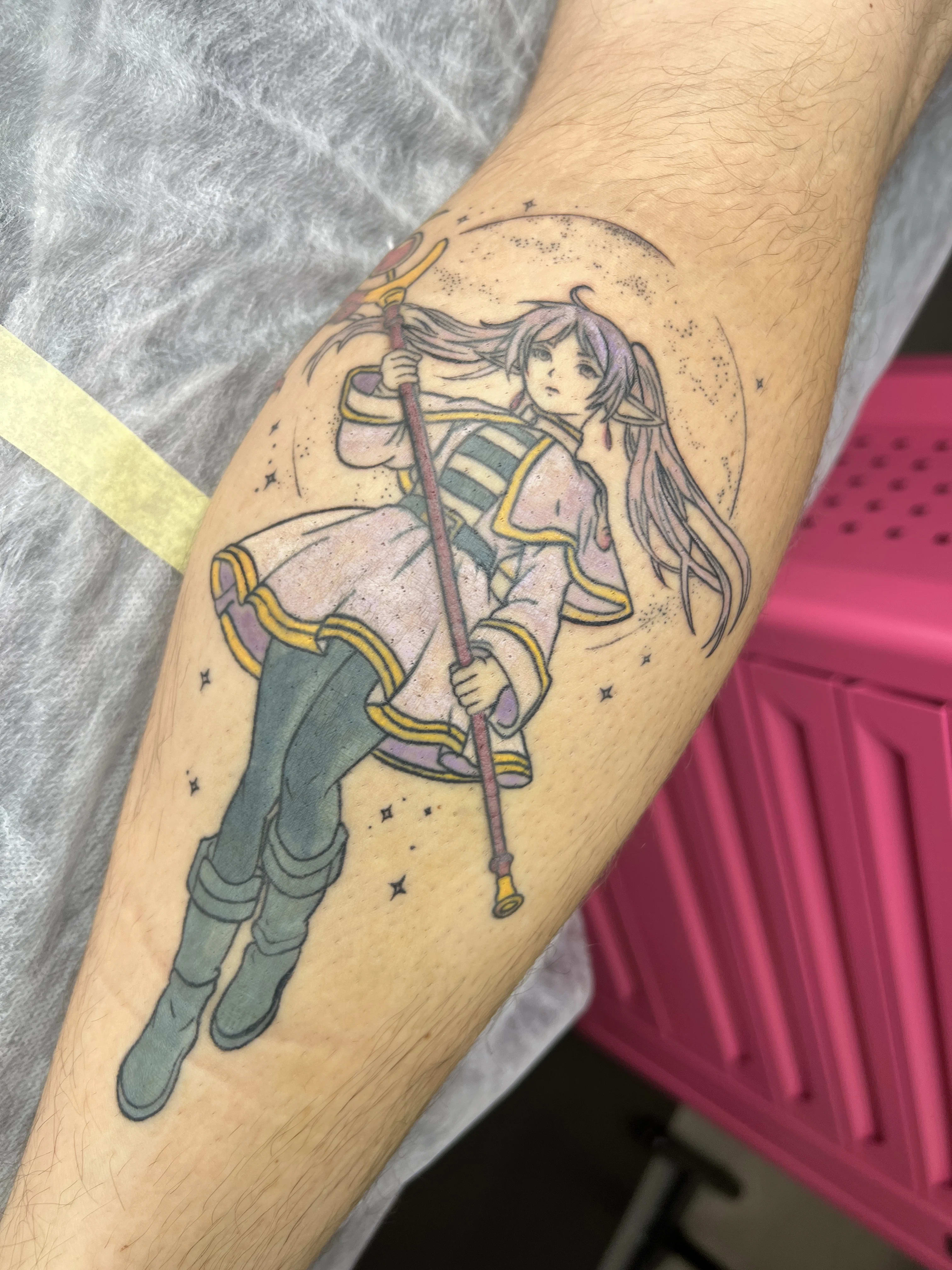
Sorceress in astral halo
Justyna Góra • Tattoo Artist • Permanent Makeup
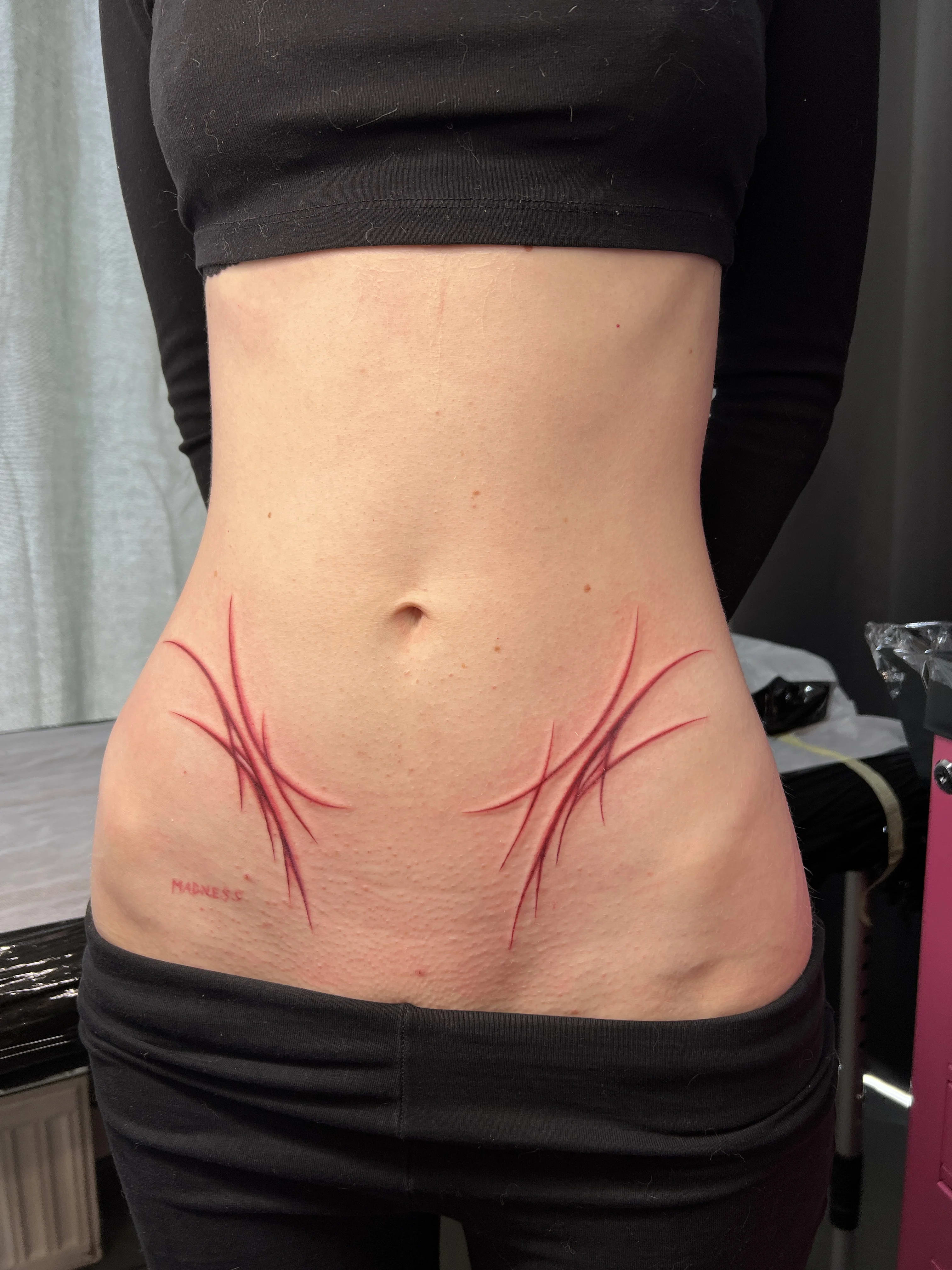
Crimson 3D scars
Justyna Góra • Tattoo Artist • Permanent Makeup
Indicative ranges — every piece is quoted individually after a free consultation.
Minimalist tattoo
300 PLN
~75 €
A single small motif in a thin line, with no shading or fill — one symbol, a date or a short word. The shortest session on our list.
Get your quoteSmall design
from 400 PLN
~100 €
Small motifs, lettering and single elements with detail or light shading — usually one short session.
Get your quoteMedium project
500–1000 PLN
~125–250 €
Hand-sized compositions: fine line, ornaments, lettering with graphics, smaller shaded motifs.
Get your quoteLarge project
1000–2000 PLN
~250–500 €
Detailed designs on the forearm, calf or back — more detail, often longer or multi-stage work.
Get your quoteSleeves and large pieces
individual quote
Sleeves, large compositions and multi-session projects are billed per session across several appointments.
Get your quoteThe ranges are indicative. The final, binding price is set after the consultation and once the design is approved.
Our artists’ portfolio is the best test of whether a style fits your skin and idea. Filter by style, body placement or tags.
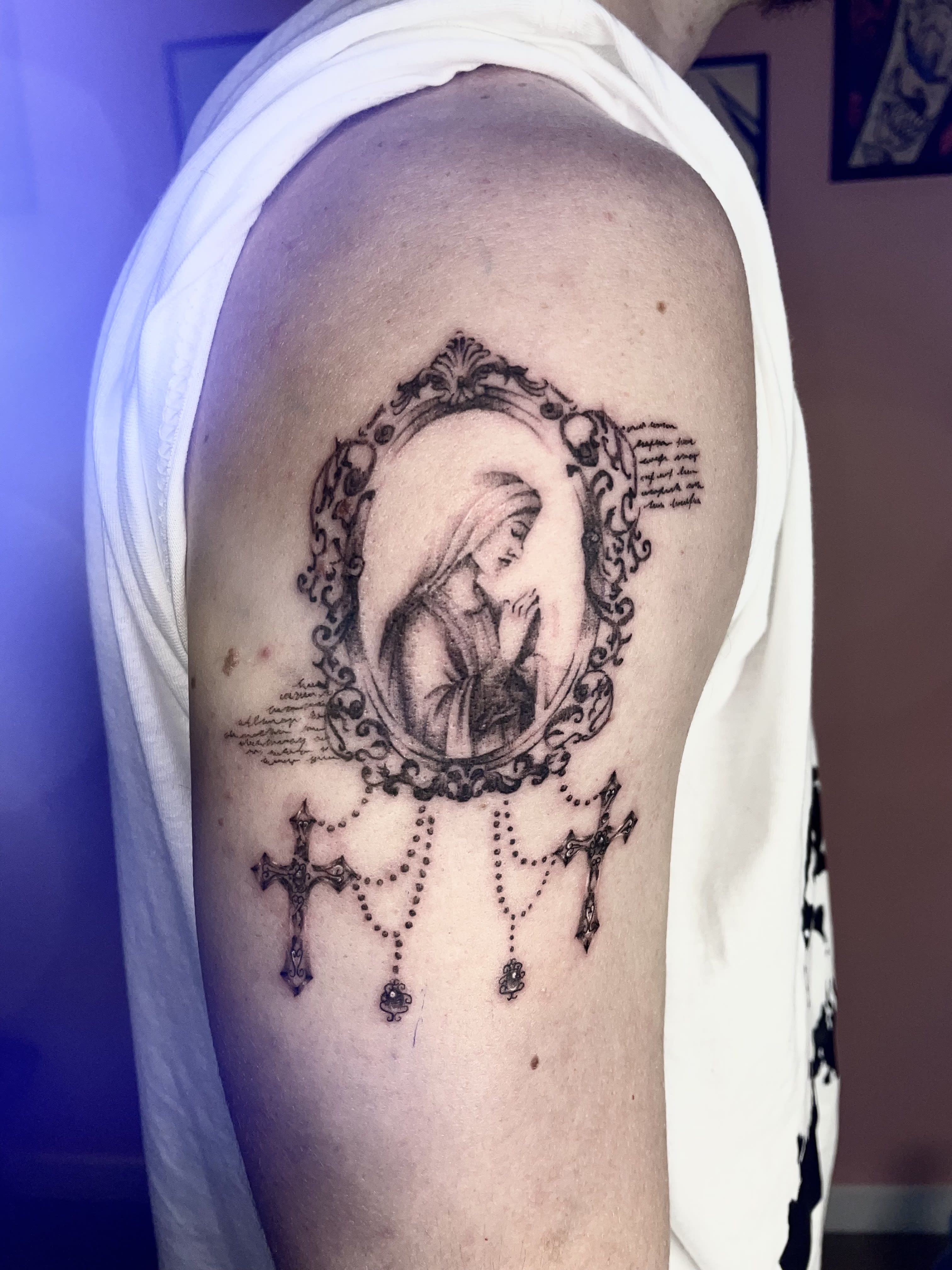

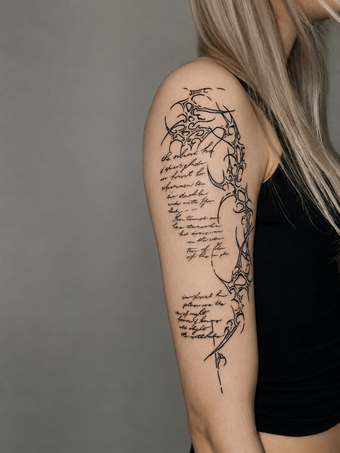
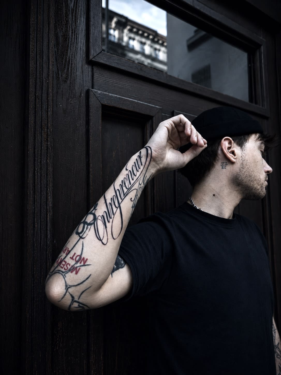
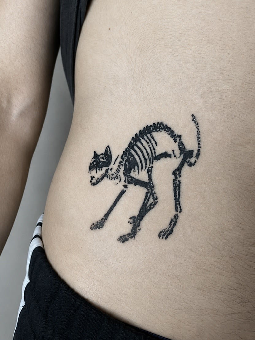

Each artist has their own specialities — see profiles and portfolios, or describe your idea in the form and we’ll match the right person.
The techniques in this gallery have their own pages — motifs, healing, prices and healed examples.
We cover old or unloved tattoos with a new design. See before-and-after transformations straight from our studio.
Practical guides by our artists — pain, aftercare and preparation. No myths, no scare stories.

Original projects waiting for an owner — each with a price and a suggested size.
The questions that matter most
Describe it in the form — we’ll suggest a style, an artist and the nearest date. The consultation and quote are free.