Tattoo lettering — ideas, quotes and languages that age well
A script is the most direct tattoo there is: no metaphors to decode, just the words you chose forever. And that's exactly why choosing those words is often harder than choosing the largest graphic composition. This guide is a box of inspiration: proven directions for a script that won't age faster than your phone, rules for choosing the language without risking a slip-up, and a few ideas you might not have thought of — from coordinates to grandma's handwriting. About typography itself — the typefaces, sizes and technique — read on our Lettering style page. Here we focus on what comes before typography: WHAT to write so that in a decade you still sign under it with pride.
Rule one: words that have passed the test of time
The safest investment in lettering is words that have already proven their durability. A phrase that survived two thousand years is unlikely to age over the next thirty — which can't be said of a quote from a TV show that's iconic today and will need a footnote in five years.
This doesn't mean pop culture is out — it just means it's worth applying a test: would these words mean something to you if no one else knew them? If so — take them. If they only work as a fandom recognition code, factor in the risk that the fandom fades.
The second filter: the privacy scale. Our clients' best scripts are fully understood only by them — a date without a caption, a single word from a family language, a phrase from a letter. A tattoo doesn't have to explain itself to the world; it's enough that it explains itself to you.
The third filter, brutally practical: read your candidate out loud at breakfast, on a Monday, in no particular mood. Words that survive that test survive everything.
Latin phrases — a classic that needs no updating
Latin is the Swiss army knife of lettering: short, elegant, timeless and resistant to trends. A few proven directions with translations, so you know what you're wearing:
Temet nosce — know thyself. Amor fati — love of fate; embracing life whole, with its twists. Memento vivere — remember to live (the brighter sibling of memento mori). Per aspera ad astra — through hardship to the stars. Alis volat propriis — she flies with her own wings. Dum spiro, spero — while I breathe, I hope. Acta non verba — deeds, not words.
Two safety rules: first, we verify spelling in a dictionary, not on Pinterest — the internet is full of Latin with typos copied thousands of times. Second, shorter means better: a two- or three-word phrase looks stronger on skin than a whole line and leaves the typography room to breathe.
If Latin sounds too textbook for you — its younger siblings are Italian and French phrases (dolce vita, joie de vivre) and Greek, which adds a beautiful alphabet. The verification rules are the same.
Dates, times, coordinates — the poetry of numbers
Numbers are lettering for people who don't trust words. A child's birth date in Roman numerals, the time 17:43 when someone came into the world, the coordinates of a family home, a summit or a first date — a specific that no trend can invalidate.
Roman numerals (XII·IV·MMXXIV) give lettering an architectural rhythm and a hint of mystery — a passer-by won't read the date on the go, but you will. Arabic numerals are more concise and more legible at small sizes. Coordinates look best in a single discreet line: 51°06'N 17°02'E can say 'Wrocław' elegantly and in a whisper.
Less obvious directions: the frequency of a favourite sound, a child's shoe size from the day of birth, the score of a match that changed a life, the designation of a star from an astronomical catalogue. Numbers are infinitely capacious — and mercilessly demand verification before the session, because a comma in the wrong place is a different hemisphere.
With us every date and every coordinate goes through a double check at the design stage. We once caught a mistake in a wedding date — and yes, the newlyweds still don't talk about it.
Handwriting of loved ones — the script no one else has
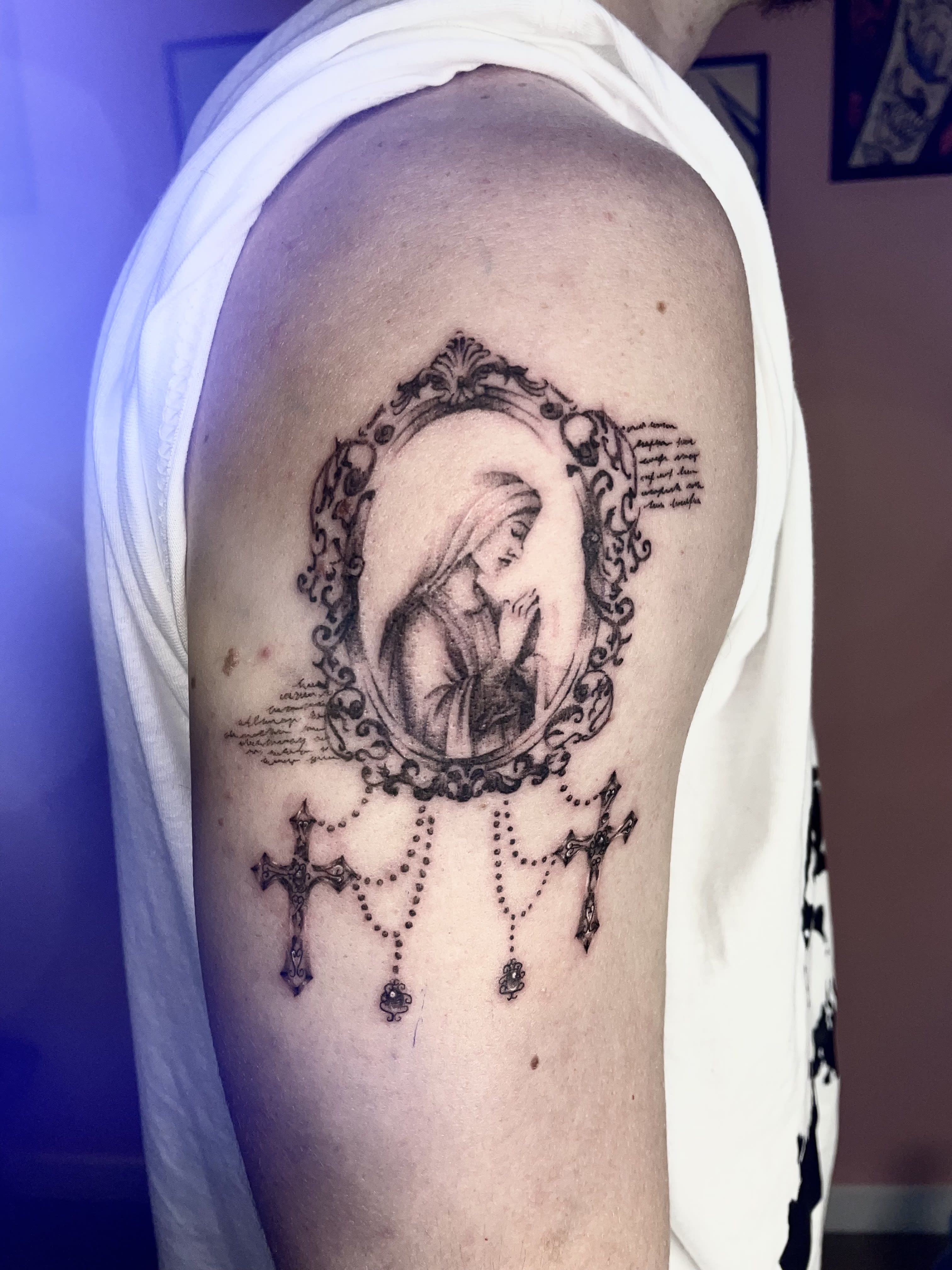
In an age when we all write in the same font from a phone, handwriting has become a fingerprint. A dedication from a book from mum, an 'I love you' from a birthday card, grandpa's signature from a document — carried onto skin stroke by stroke, they become a tattoo that can't be replicated, because there is no second handwriting like it in the world.
These are the most moving lettering commissions we do — and technically very satisfying: we preserve every flourish and imperfection, because those carry the character. We correct at most the size and spacing, so the piece ages well.
The source material: a scan or a sharp photo of the original in daylight. We've reconstructed from crumpled notes, faded postcards and texts copied out by hand — with varying difficulty, always with a happy ending.
A variant for the brave: your own handwriting. Your 'never give up' written in your own hand carries a different power than the most beautiful typeface in the world — because promises are signed personally.
Foreign languages without a slip-up — a safety manual
The internet is full of tattoos that were meant to say 'freedom' and say 'soup'. Not because foreign languages are a bad idea — because verification was skipped. Here's the protocol we follow:
Rule number one: the source of the translation isn't a translator app or a Pinterest graphic, but a person who knows the language — a native speaker, a philologist, a teacher. Rule number two: with non-Latin scripts (Japanese kanji, Arabic, Hebrew, Cyrillic) we check not only the meaning but also the correctness of the writing — direction, ligatures, cultural context. A character that means the same thing can sound poetic or bureaucratic.
Rule number three: we check the meaning both ways. Not only 'how to write X in Japanese', but also 'what exactly this writing means to a Japanese person'. The difference can be painfully funny — but let it be funny in an anecdote, not on a forearm.
With us, a script in a foreign language without a reliable source simply doesn't go on skin — we'll ask for verification or help arrange it. We'd rather push the session a week than become part of someone's funny post.
Directions you might not have thought of
Beyond the classics there's a whole shelf of less obvious ideas — a few of our favourites:
One anchor word: instead of a whole phrase, a single word that works like a reset button — 'breathe', 'enough', 'onwards'. Minimalism of content meets minimalism of form; more about this aesthetic on our Minimalist style page.
A family phrase: dad's saying, a mangled word from childhood, a line from a family legend. No outsider will understand — and that's the point. A line from a song, but not the chorus: a line from the second verse that only real listeners know ages better than a big hit.
A two-person script: halves of one phrase on two people, coming together as a whole — we write more about shared tattoos in our guide to minimalism. An initial letter in a beautiful typeface: sometimes a whole story fits in a single character.
And the classic of the genre, forever underrated: silence. If after reading this guide no script feels important enough — maybe your story prefers an image? The guide to choosing a style is waiting nearby.
Script and placement — where words read best
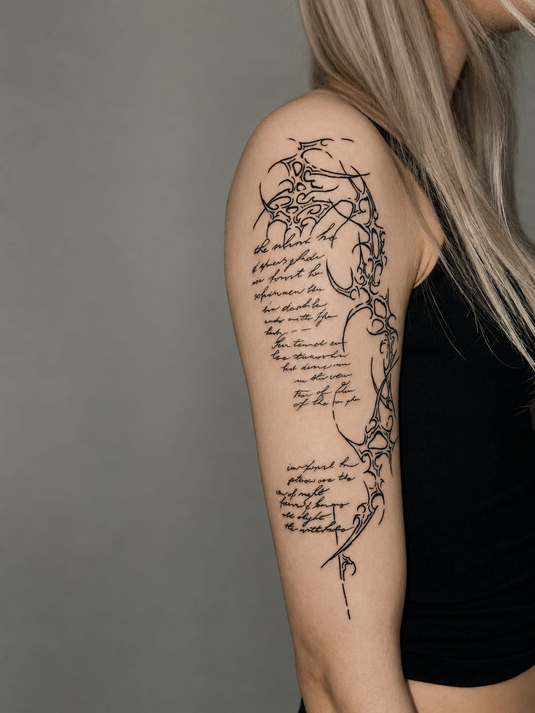
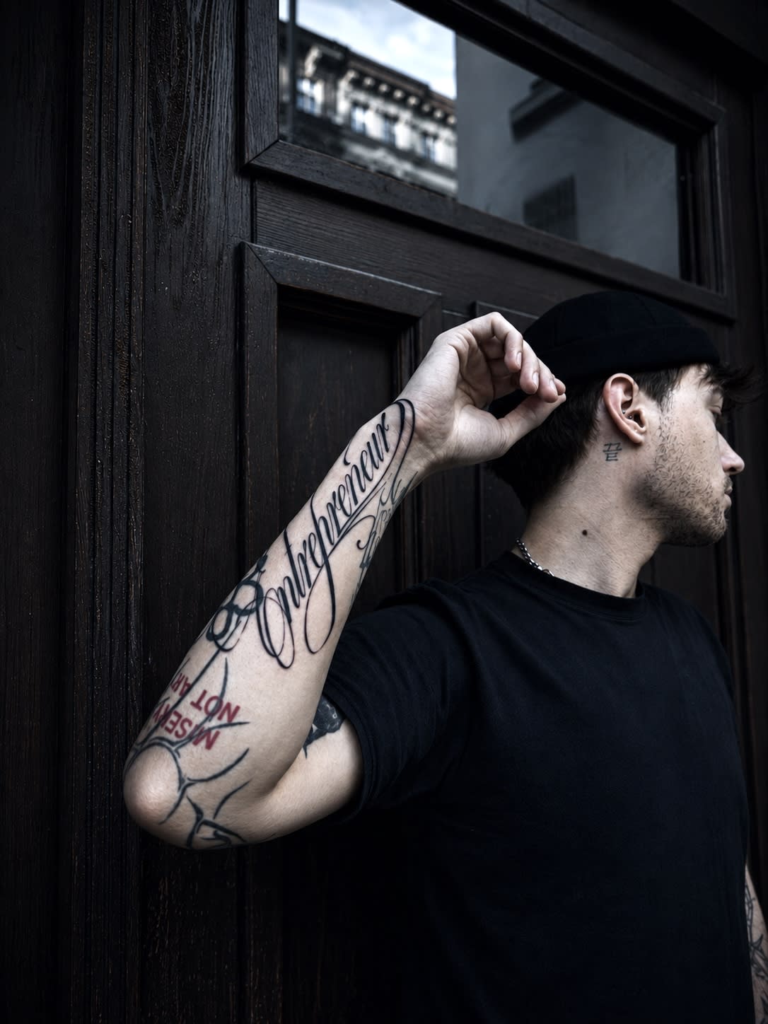
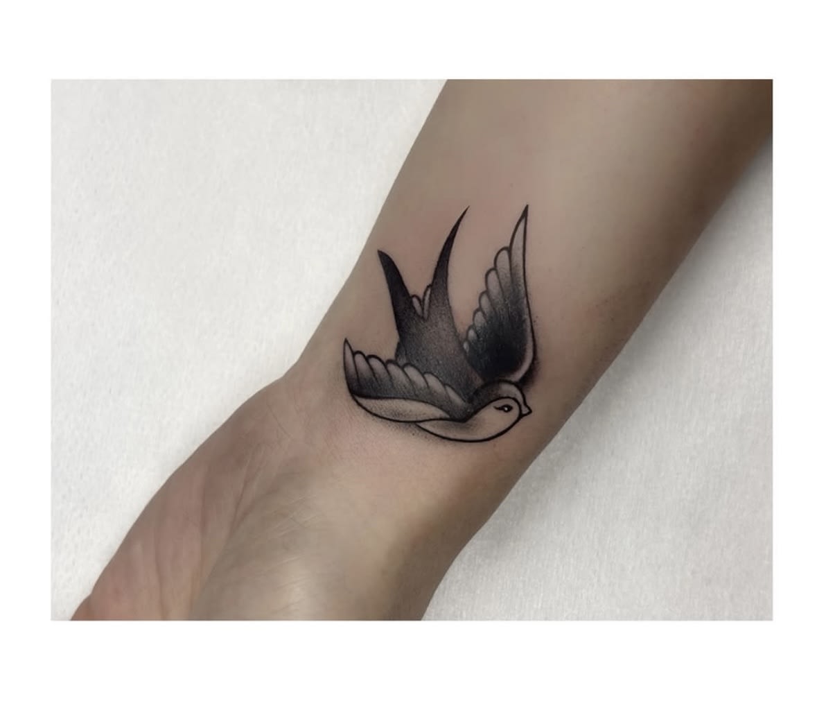
Briefly, since the technical detail is on the Lettering page, but when choosing content it's worth knowing the geography: the forearm is a natural 'line' for medium-length phrases, read by you — motivational words work strongest here. The collarbone likes short scripts running along the bone; the wrist — single words and dates.
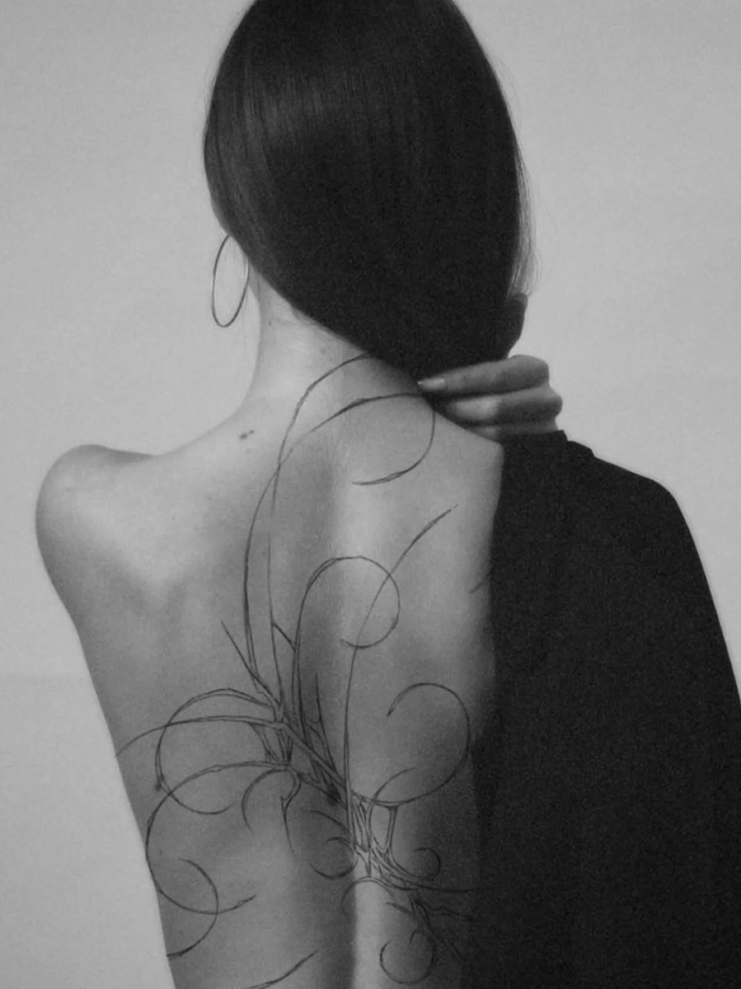
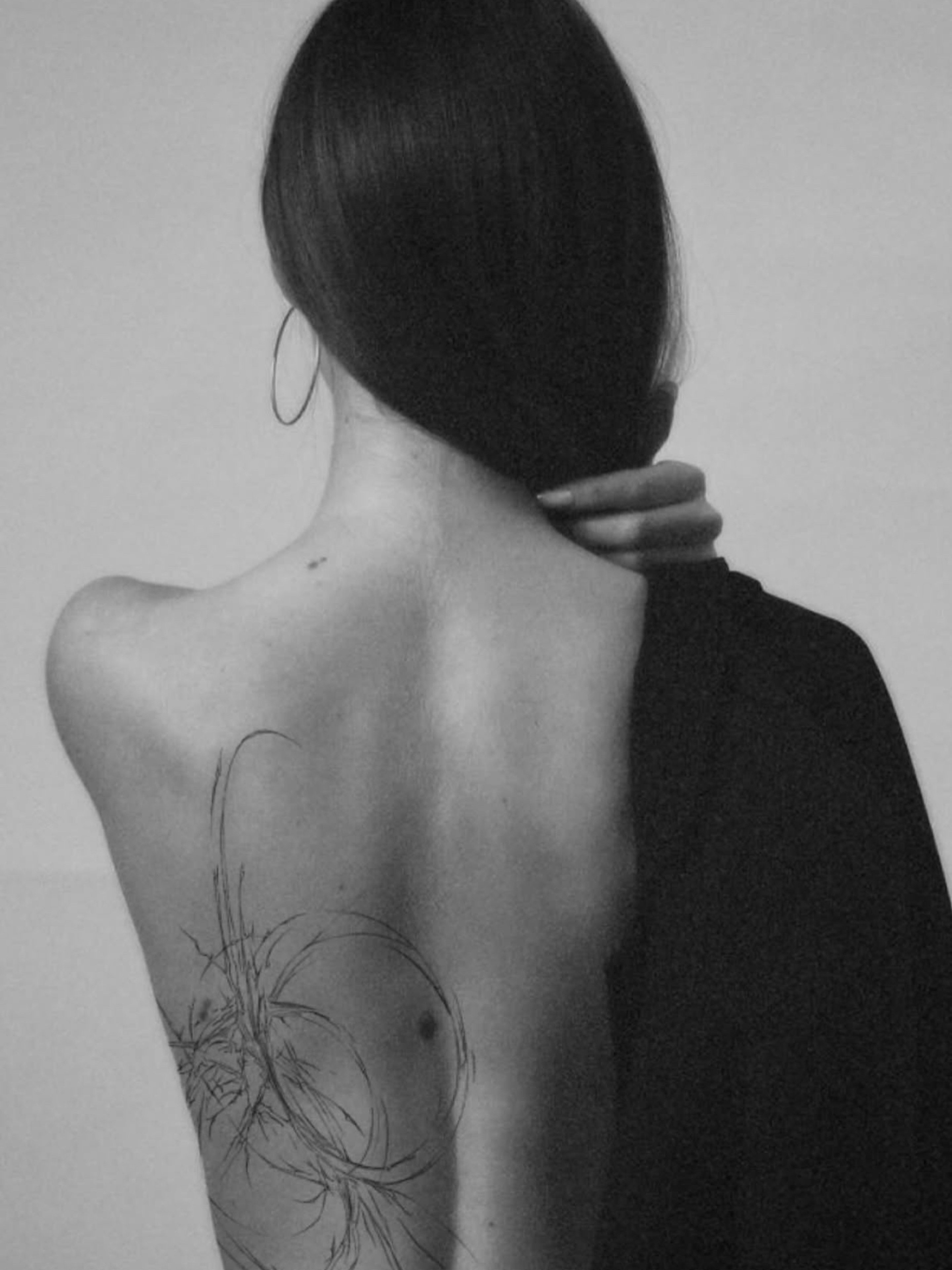
The ribs and spine are zones for private scripts — longer phrases you show when you want. The nape carries short phrases with a touch of mystery (you don't see them yourself — others do).
The general rule: the longer the text, the calmer the placement it needs. A whole stanza on the forearm ends up as microprint; the same words along the ribs get space and gravity.
Letter size is the mathematics of durability: the smaller and more ornate the typeface, the larger the script must be. At the consultation we try the content against the placement at one-to-one scale — before anything becomes forever.
From idea to script — how it works with us
Got the words? We'll handle the rest together. Send the text through the form — with the story behind it, because choosing the typeface starts with meaning, not with a font catalogue. You'll get two or three typographic proposals from us with a one-to-one size preview.
At the free consultation in our studio at ul. Poświęcka 17/40 we fit the script to the body: vertical, horizontal, the spacing between letters, how the phrase behaves in movement. A lettering session is usually short and gentle — most scripts are a single visit.
Price-wise, scripts start at the lower end of our Price list — small pieces from about 400 zł — and you'll learn the exact amount at the design stage, with no surprises.
One thing we promise in writing (of course): before the needle touches skin, your script will be checked linguistically, typographically and compositionally. Because in tattoos made of words the old printers' rule applies: think twice, set once.
HOLD FAST — a short history of words on skin
Lettering is one of the oldest tattoo genres — and its pedigree is purely practical. Sailors of the age of sail tattooed the phrase HOLD FAST across their knuckles — one letter per finger. They believed the words would give their hands strength on the ropes during a storm. An eight-letter working prayer, read every time they clenched their fists.
The same era gave lettering a second genre: names. Ports were full of hearts with the names of loved ones — and, as the chronicles honestly note, of tattooists making a living reworking those names after the voyages home. Some lessons humanity has been redoing for centuries.
The twentieth century added a voice of protest and identity to lettering: from numbers and dates of important battles to the lyrics of whole subcultures. Chicano lettering — the ornate letters of the West Coast — grew precisely from the need to wear belonging on skin, written beautifully in defiance of everything.
Today a script on skin is a continuum of that history: we still wear anchor-words, amulet-words and declaration-words. Only the typography has changed — and, thankfully, the sterility of the needles.
A ready cheat sheet — 30 short phrases that age well
Treat this list as a starter, not the main course — the best script you'll bring from your own story anyway. But if you're looking for a starting point:
- In English: 'it'll be okay' · 'one more day' · 'in spite of everything' · 'onwards' · 'enough' · 'here and now' · 'by the way' · 'against the grain' · 'breathe' · 'to the end'
- Latin: amor fati · temet nosce · memento vivere · dum spiro spero · acta non verba · per aspera ad astra · alis volat propriis · hic et nunc · semper fidelis · veritas
- World classics: hold fast · this too shall pass · one day at a time · la vie est belle · dolce far niente · c'est la vie · still I rise · onwards · breathe · enough
What not to tattoo — a tongue-in-cheek list of cautions
To finish, a section that could be called 'the archive of future cover-ups'. All examples from the life of the trade — names and numbers changed to protect the guilty.
A partner's name after three months of a relationship. A classic of the genre, forever at the top of the cover-up list since the sailors' days. We'll honestly admit the exception: children's and parents' names — those relationships have different statistics. The name of your current employer: loyalty is a beautiful thing, but an employment contract is rarely for life — and a corporate logo on the calf stays after the notice period.
'On the hate' phrases: a script chosen in anger at someone or at the world is then read daily — and anger has a shorter shelf life than pigment. Memes and words of the year: funny today, needing a footnote in three years, archaeological in ten. The Monday-breakfast test works flawlessly here.
And our favourite category: scripts 'checked by a mate who knows English from games'. A mate can be a good companion — a worse language reviewer. For verification there's us and dictionaries; both cheaper than a cover-up.
Seriously, to finish: if you have any doubt whether your idea belongs on this list — bring it to the consultation. We'll tell you honestly, with warmth and without laughing. We only laugh at those who didn't ask.
Frequently asked questions
Apply three filters: would the words mean something to you if no one else knew them; have they already survived some time in your life (not from yesterday's playlist); and, read aloud on an ordinary Monday, do they still work. A candidate that passes all three — stays.
Short phrases on your own skin are private use — in practice it's not a legal problem for you. It's worth remembering the cultural durability test, though: a quote iconic today may need a footnote in a decade. Classic phrases and your own words age more safely.
The one that means something to you — the aesthetics come from typography, not exotica. If you choose a foreign language, the iron rule is: verification by a person who knows the language, never from a translator app or an internet graphic. We'll help arrange the check before the design.
It can, and increasingly is — Polish on skin has stopped being exotic and reads strongly precisely because everyone around understands it. 'It'll be okay' can hit harder than its English equivalent, because you can't read it indifferently.
Technically — any length; practically — the longer the text, the larger and calmer the space it needs (ribs, spine, along the forearm). Short phrases give more freedom of placement and typeface. At the consultation we try the content at 1:1 scale, so you decide seeing exactly the future result.
Send the script text through the form along with its story and your preferred placement. We'll prepare typographic proposals, check the language and invite you to a free consultation at the studio — a lettering session is usually a single, short visit.