Men’s Tattoos — Styles, Placements and Motifs That Age Well
Type “men’s tattoo” into a search engine and you’ll get hundreds of galleries recycling the same ten images: wolf, lion, compass, skull. The problem is that a gallery answers none of the questions we actually hear at consultations. Will this motif sit well on my forearm? What does it cost? What will it look like in ten years? We wrote this guide the way we talk in the studio: concretely, without padding, with anatomy in the lead role. You’ll find an overview of the styles men actually choose, an honest discussion of body placements — pain and visibility included — real price ranges, and a list of the things people most often regret years later. One note up front: we treat “men’s” as a search label, not a rule. Skin has no gender, and a good design comes from anatomy and character, not a catalogue drawer. Everything below is how we work day to day in our Wrocław studio.

What “men’s tattoo” really means — and why it’s a loose label
Let’s defuse the phrase itself. In studio practice, “masculine” usually means three things: larger scale, stronger contrast, and motifs rooted in the symbolism of strength, journey or memory. None of that is a canon — the same qualities work beautifully on women, and a delicate fineline piece can be the best decision for a man with slim forearms.
Where does the division come from? Search engines. People search “their way” and catalogues answer with drawers. We treat the label as a conversation starter: you say you want something masculine, we ask what that means to you. For one man it’s stark blackwork across half an arm; for another, a small symbol for his late father, hidden under a watch strap.
So instead of asking whether a design is masculine enough, ask whether it suits your build, your lifestyle and what you want to carry on your skin for decades. The rest of this guide answers those questions.
The styles men choose most often
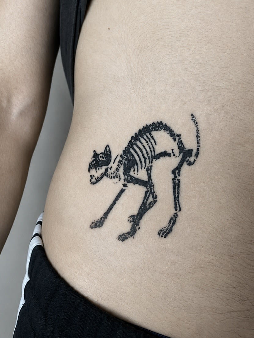
Blackwork has been the most frequent pick for years: full, decisive black, bold graphics and compositions you can read from across the street. It ages superbly because it doesn’t depend on subtle tonal transitions. If you value rawness and order, start your browsing here.
Realism operates at the opposite pole: portraits, animals and film scenes rendered from photographs, with light and shadow building depth. It demands larger scale and a very deliberate choice of artist — weak realism ages worst of all conventions, while good realism keeps turning heads for years.
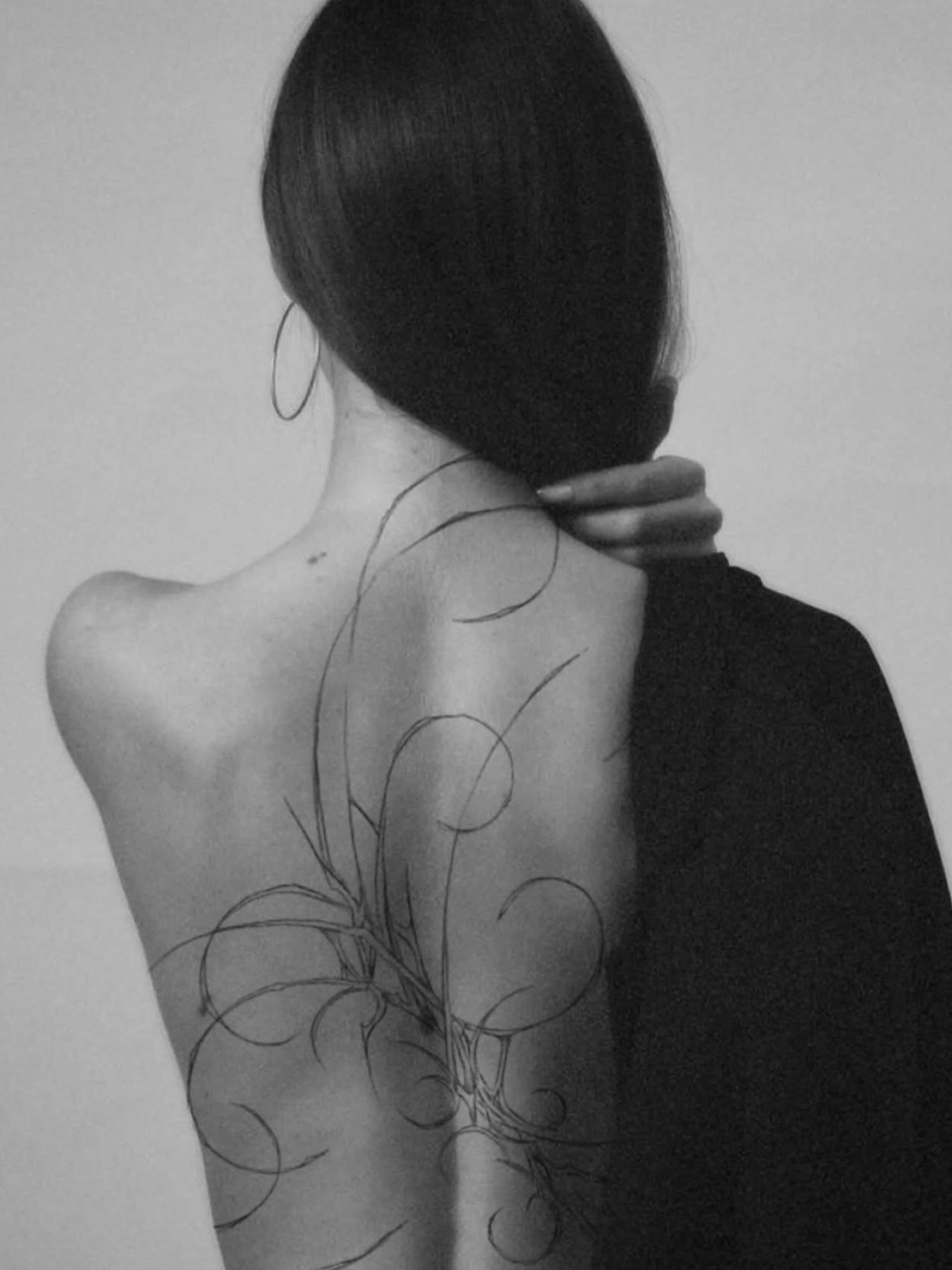
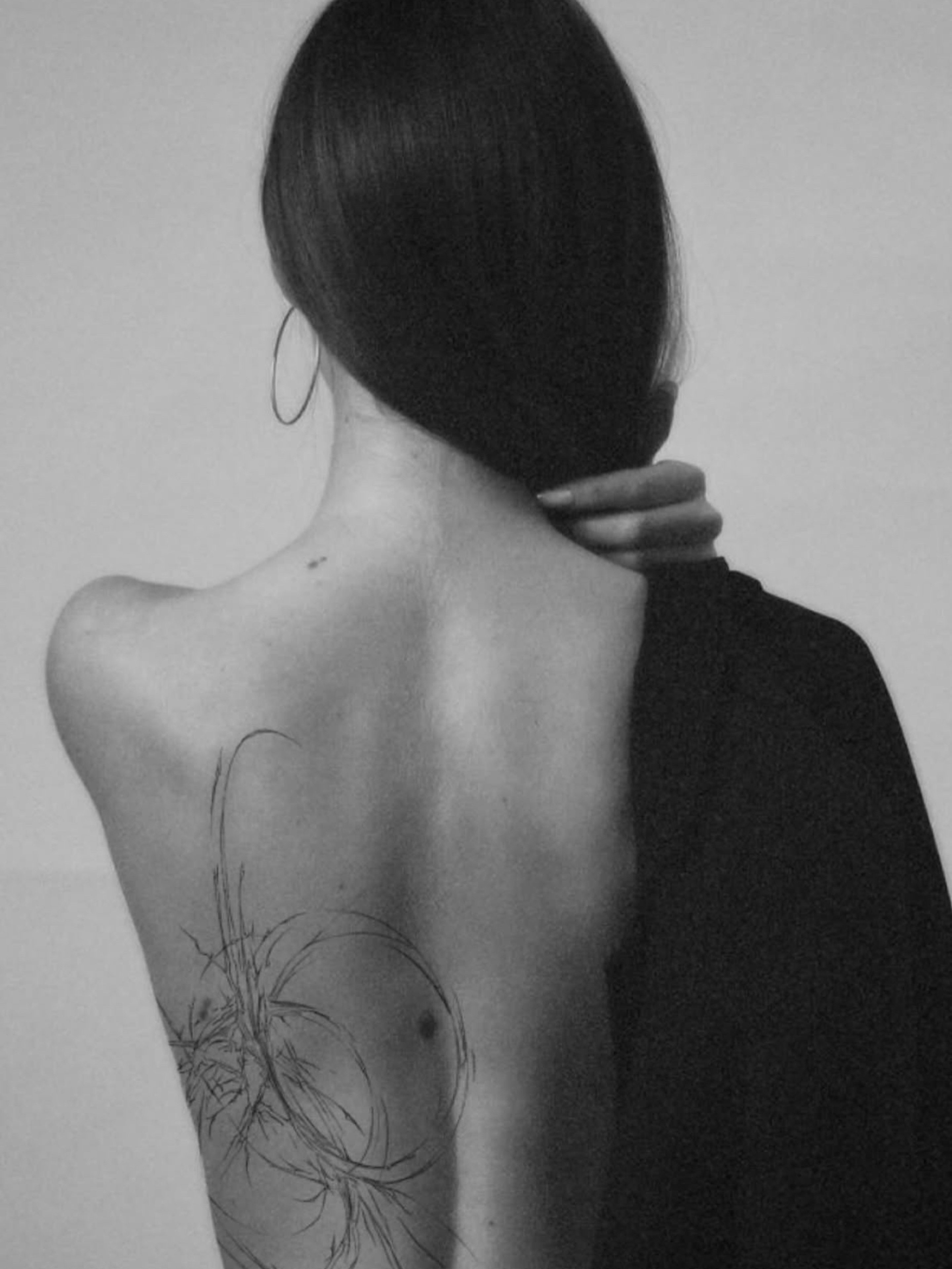
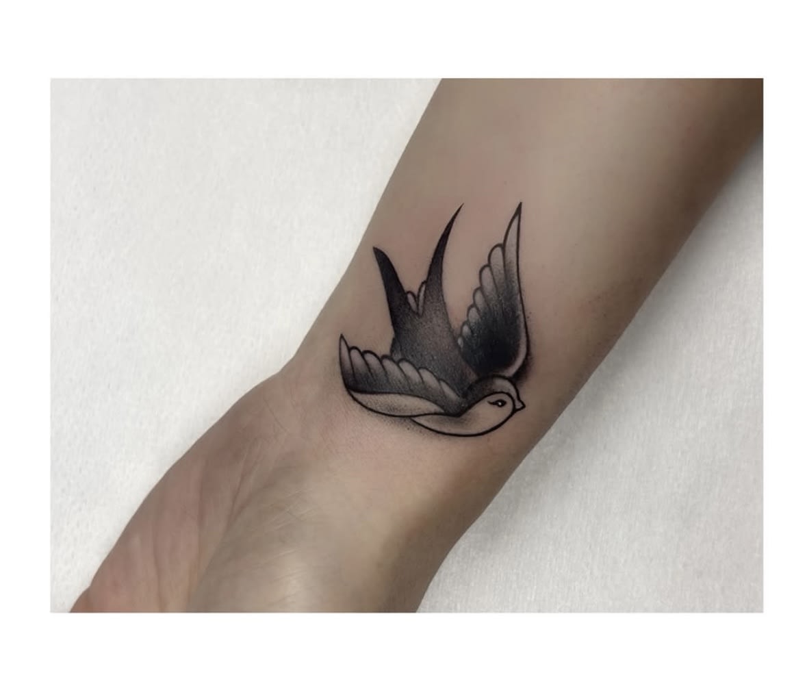
Between the two stretches a whole spectrum: geometry and dotwork for analytical minds, ornamental work inspired by architecture, Japanese irezumi with koi and waves designed for whole body sections, old school with anchors and swallows that has looked right for a century, and sketch style — raw, deliberately “unfinished” linework straight from a sketchbook. We describe each language in detail on our style pages; the map here is simple: the more detail and tonal transition, the larger the scale should be and the more carefully you should choose your artist.
The forearm — the default first choice, for good reason
If there is a default placement for a man’s first piece, it’s the forearm. The reasons are practical: the surface is flat and well exposed, a session hurts moderately, and a long sleeve covers everything in a second when the situation calls for it.
Forearm anatomy favours vertical compositions: a dagger, a spear, handwriting along the radius, a wolf or raven guided along the muscle line. Round motifs — mandalas, compasses — fit too, but need deliberate placement so they don’t float between wrist and elbow.
The common mistake? Cramming a miniature onto the forearm that will blur into a smudge within five years. Scale matters: this part of the arm forgives a lot, but looks best claimed boldly — from a third of its length upward.
Upper arm, shoulder and the road to a sleeve
The upper arm is a classic for reasons visible at any gym: a motif laid over the rounded deltoid works together with the body. Compositions designed for three dimensions from the start do best here — Greek sculpture, a crowned lion, armour elements flowing onto the shoulder.
A sleeve — full-arm coverage — is a multi-session project costing several thousand to well over ten thousand złoty, spread over time. The key decision comes first: are we building one coherent story (say, Japanese, with waves binding the motifs) or a collection of independent graphics connected by background? Both roads are good — only the third is bad: sticking on random designs with no plan and no breathing room.
Practical advice from the chair: if you dream of a sleeve but the budget says start with one element, say so at the consultation. We’ll design the first motif so the future build-out has something to connect to — it saves compromises later.
Chest and back — the epic format
The chest suits symmetrical compositions and subjects meant to stay close: children’s names, dates, symbols of faith. The large, fairly flat surface takes panoramas (wings, two mirrored lions) as well as a single strong accent over the heart. Honestly: the sternum and collarbone areas can be rough, so as a first piece it’s an ambitious pick.
The back is the body’s largest canvas and the only one where a monumental scene — a valkyrie over a battlefield, a samurai in mist, an architectural composition — fits without compromise. A full back is a year of regular sessions; a realistic alternative is the upper half or the shoulder blade, which look complete on their own.
What galleries don’t mention: chest and back pieces are seen mostly by you, in the mirror. For some that’s a drawback. For many of our clients it’s precisely the point — a private story, not a business card.
Calf, thigh, and the “think twice” zones: hands, neck, fingers
The calf is underrated: a large, muscular surface with low pain levels, naturally on display in summer and easy to cover in winter. It carries vertical motifs beautifully — from Greek columns to realistic animal portraits.
The thigh offers even more room plus full everyday discretion; more and more men choose it for larger multi-session graphics they don’t want to announce to the world.
Hands, fingers and the neck are a separate category of decision. Technically: the skin there never stops working, so fine lines blur faster and touch-ups are practically built into the plan. Socially: these are placements you can’t cover at a bank job interview. We don’t refuse them on principle — we do them regularly — but we always ask about your professional context and suggest they not be your first piece ever.
Motifs and their symbolism — from wolves to runes
Animals have led the field for years, and no wonder: the wolf carries pack loyalty and lone strength, the lion calm authority, the bear protective power, the raven wisdom and memory. A well-guided animal motif joins symbolism with anatomy: an eagle’s wings spread across the shoulders say what no lettering can.
Mythologies are the second great reservoir. Norse runes, Mjölnir, longships; the Greek Atlas carrying the heavens; Slavic symbols and forest spirits. One craftsman’s note: some symbols get appropriated by subcultures whose message you don’t want to send. We check these things at the consultation — that’s part of our job.
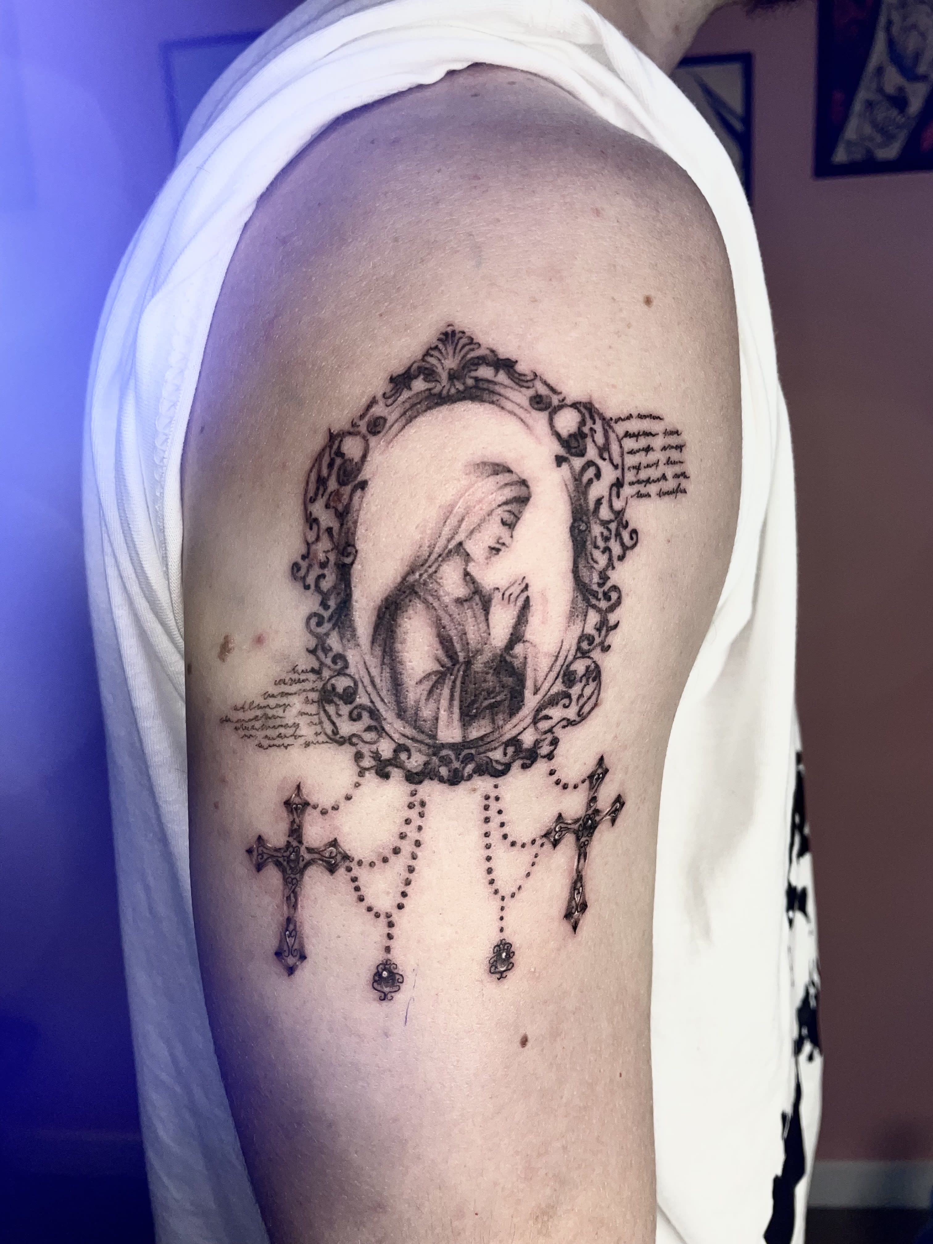
The third current is memory and faith: a cross on the forearm, dates in Roman numerals, a father’s portrait, the paw print of a dog who passed. These pieces are made differently — slower, with conversation. The result doesn’t have to be large; it has to be right.
Compasses, clocks and maps — symbols of the road — deserve their own paragraph. Yes, they’re popular. No, popularity doesn’t disqualify them: copying one-to-one from Pinterest does. The same compass drawn from scratch for your forearm is a different class of work than an internet print-off.
Script and lettering — when a word hits harder than an image
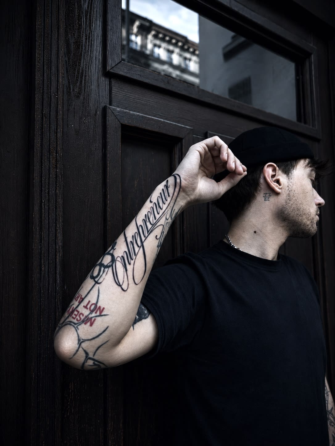
A quote, a name, a date, one anchor word: lettering is the oldest “masculine” genre and still among the most commissioned. Its strength is simplicity; its risk is execution. Type set too small grows shut, an overly ornate face becomes unreadable, and a spelling error in a foreign language stays forever (yes, we verify spelling and sources — Latin and Japanese kanji included).
Good practice is simple: a minimum of 8–10 mm letter height for texts meant to stay legible over the years; open, breathing typefaces rather than cramped blackletter at small sizes; a placement where skin moves least. The inner forearm, the ribs below the heart and the collarbone are classics for a reason.
We cover typefaces, languages and prices in a separate lettering guide — here we’ll leave the master rule: a word on skin must survive being read aloud. If it sounds pretentious today, it will sound worse in ten years.
Small or large? Scale, legibility and the test of time
Physiology is relentless: pigment spreads slightly over time and lines thicken by a fraction of a millimetre. In a large graphic the process is invisible. In a miniature stuffed with detail — fatal. The smaller the piece, the simpler the form must be: a symbol, an outline, a monogram.
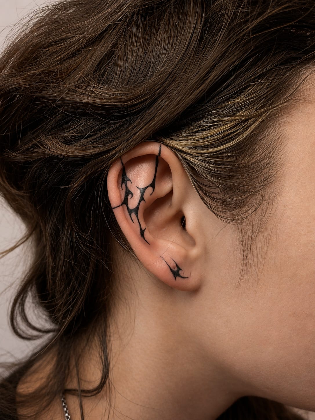
Small designs have their place — wrist, ankle, behind the ear — and their elegance. It’s just an honest deal: small means simple. Show us a three-centimetre wolf with full shading and you’ll hear a proposal: either bigger or simpler. Not a whim — a guarantee that in five years it will still be a wolf.
Large scale, in turn, doesn’t mean more pain at once — it means a project spread over time: an outline session, then fills. Skin heals between sessions and you watch the progress. Most sleeves and back pieces grow at a rhythm of one session every 4–8 weeks.
How a design is born at Parvata — from conversation to artwork
We start with a free consultation: you bring an idea, references, sometimes just a feeling you want captured in graphic form. We talk placement, scale and budget. Then we match you with an artist — each member of our team speaks a different visual language, from realism through ornament to sketch, so pairing style with subject is half the success.
The design is created for your anatomy, not on an A4 sheet. The same motif flows differently along a forearm than it sits on a shoulder blade — so we draw on a photo or template of your actual body part. You see the design before the session and you have the right to revisions; we’d rather move a date than tattoo a compromise.
On session day you get a sterile station, single-use needles and calm — we work by appointment only, with no queue behind your back. Afterwards you leave with a dressing, aftercare instructions and your artist’s contact. The first touch-up after healing, if needed, is free.
What a men’s tattoo costs in Wrocław — real ranges
Honest numbers instead of “priced individually”: a small, simple design starts at 400 zł with us. A mid-sized project — say, a composition over half a forearm — usually runs 500–1000 zł. A large custom graphic covering a full forearm, calf or chest section most often lands between 1000–2000 zł per session. Sleeves and backs are priced in stages, being multi-session projects.
What drives the price? Scale and detail first, then placement (ribs or hands take more time for the same area) and technique — full realism means more hours than clean linework. The price includes the design, the session and the post-heal touch-up mentioned above. Full ranges for every size, with examples of finished work, are listed in our pricing.
One savings tip that isn’t saving on quality: instead of three small random pieces in a year — one considered, larger work. The cost comes out similar, and what stays on your skin is class, not a collection of accidents.
Pain — an honesty map
Question number one at consultations, so here’s the answer without theatre. The scale is individual, but the topography repeats: outer forearm, upper arm, calf and thigh are comfort zones — most clients chat with us through the session. Ribs, sternum, inner biceps, knee and foot can demand gritted teeth.
The good news: session pain is predictable and manageable. Sleep well, eat a proper meal, hydrate, skip alcohol the day before — those four things make a bigger difference than any numbing cream. On long sessions we schedule breaks; nobody wins medals for suffering here.
You’ll find our detailed pain map with a rating for every zone in a separate article — if you’re torn between two placements purely because of pain, the answer is there.
Healing, men’s edition — gym, physical work, sport
The standard you know or will learn: dressing, washing, a thin layer of cream, 2–3 weeks of protection from sun and soaking. The full protocol lives in our aftercare guide; here are the three things men ask about most.
Gym: for the first 7–10 days skip training that engages the tattooed area. Sweat won’t ruin the work, but clothing friction, stretching fresh skin, and equipment touched by dozens of hands are a straight road to irritation. Return gradually, starting with body parts away from the design.
Physical work: if your job involves dust, grease or constant workwear friction, tell us before the session. We’ll pick the placement or the date so the hardest healing days fall outside your work week — sometimes a Thursday session instead of Monday is all it takes.
What to avoid — the things people regret most
One-to-one copies from the internet. Ten thousand likes only means a thousand people already wear it. Inspiration — yes; carbon copy — no. Any motif can be drawn anew, better, and for you.
One-season trends. Fashion for a given symbol passes in two years; you keep it for fifty. The test is simple: did this motif mean something to you five years ago? If yes — go ahead. If you first heard of it last month — wait half a year and check if you still want it.
Partners’ names early in a relationship, symbols whose meaning you haven’t verified at the source, and “bargains” from basement studios. Fixing cheap work costs more than doing it well the first time — we know, because cover-ups fill a good share of our calendar.
And last: decisions made in a week. A good design is carried in the head for a decade — or at least a month. Skin can wait.
Old tattoo? Cover-up and refresh instead of shame
A good share of the men who come to us aren’t after their first piece — they arrive with something they want fixed. A faded tribal from 2005, a name that stopped being current, a badly executed holiday souvenir. Good news: almost everything can be covered or refreshed.
A cover-up is harder than working on clean skin — the new motif must “digest” the old one, using its dark areas as its own shadows. That’s why reworks are designed individually and usually at a larger scale than the original. The results can be spectacular; you’ll find our before-and-after gallery on the cover-up page.
The alternative is a refresh: re-striking outlines and evening out fills in a piece that’s good, just tired. It’s a shorter, cheaper session, and the difference looks like removing a filter from a photograph.
First ink after thirty or forty — relax, you’re the majority
The stereotype says first tattoos happen before twenty-five. Our calendar says otherwise: a large share of debutants are men 30+, often 40+, who carried the idea since university while career, kids and life took precedence.
It’s a great moment, in fact. You already know what matters to you — motifs chosen after thirty rarely end up on cover-up lists. Skin still takes pigment without complaint, and a mature decision usually means a better budget too: work without compromises.
If what holds you back is the question of propriety — look around at doctors, lawyers and managers. The era when forearm ink closed office doors ended a decade ago. And if your industry is still conservative, simply pick a placement a shirt covers: the thigh and chest sections are above.
Black or colour — what men pick and why
The statistic from our calendar is unambiguous: around eighty percent of men’s projects are done in black and grey. Not chance, not fashion — monochrome survives decades best, builds contrast most legibly on every skin tone, and expands most easily with future elements.
Colour has its strong entrances, though. The Japanese convention loses its meaning without the koi’s red and the wave’s blue; new school lives on saturation; a realistic animal portrait in colour can take your breath away. The practical rule: colour demands honest commitment to aftercare and sun protection, because it fades faster than black — if you know your skincare is symbolic, monochrome will be the more grateful companion.
There’s a third road we especially like: black with a single colour accent. A raven’s red eye, a golden crown detail, one chromatic burst in a grey field. Depth without the obligations of a full palette.
Tattoos and dress codes — a guide for corporate men
We discuss this at every other consultation, so let’s take it seriously. Polish reality in 2026: in IT, creative industries and trade, nobody blinks at a full sleeve. In banking, law firms and parts of administration, the unwritten rule is “the shirt covers it”. In medicine and education it varies by institution.
The strategy we suggest to the undecided: the T-shirt line and the shirt line. Designs ending above the elbow hide under a short sleeve; those ending at the wrist — only under a long one. Chest, back, thighs and calves stay private under any dress code. This simple map lets you build a serious collection with zero conversations with HR.
Remember the direction of travel too: a decade ago visible ink could end a recruitment; today it’s small talk at onboarding. You’re deciding for decades — respect your industry, but don’t design your life around the most conservative recruiter you might ever meet.
Planning a sleeve step by step — so it doesn’t end as patchwork
Step one: a leading theme. It needn’t be literal — a coherent aesthetic is enough: Japanese water, Nordic gloom, clean geometry, biomechanics. The theme works as a key that later tells you what fits and what doesn’t.
Step two: a body map. We divide the arm into zones — shoulder, biceps, elbow, forearm, wrist — and decide where the main elements land and where the connectors go. The elbow and the inner arm are the harder zones; we plan them deliberately, not “it’ll work out somehow”.
Step three: session order. We usually start with the largest elements, then close the background and transitions. Between sessions, 4–8 weeks of healing. A realistic horizon for a full sleeve is 4–8 appointments over several to a dozen months — and that’s a feature, not a bug: budget and skin both breathe, and the project matures with you.
Step four, the most important: one host for the project. A sleeve assembled by five different hands almost always looks like a compilation. Choose an artist whose language suits you and let them lead the whole; plan any guest elements together.
Tribal and Polynesian patterns — a classic returns in mature form
Tribal carries the label of a nineties mistake — and indeed, a fair share of our cover-ups are exactly those souvenirs. But let’s separate two things: mass catalogue decals from a quarter-century ago, and genuine tribal art now enjoying a renaissance in its best form.
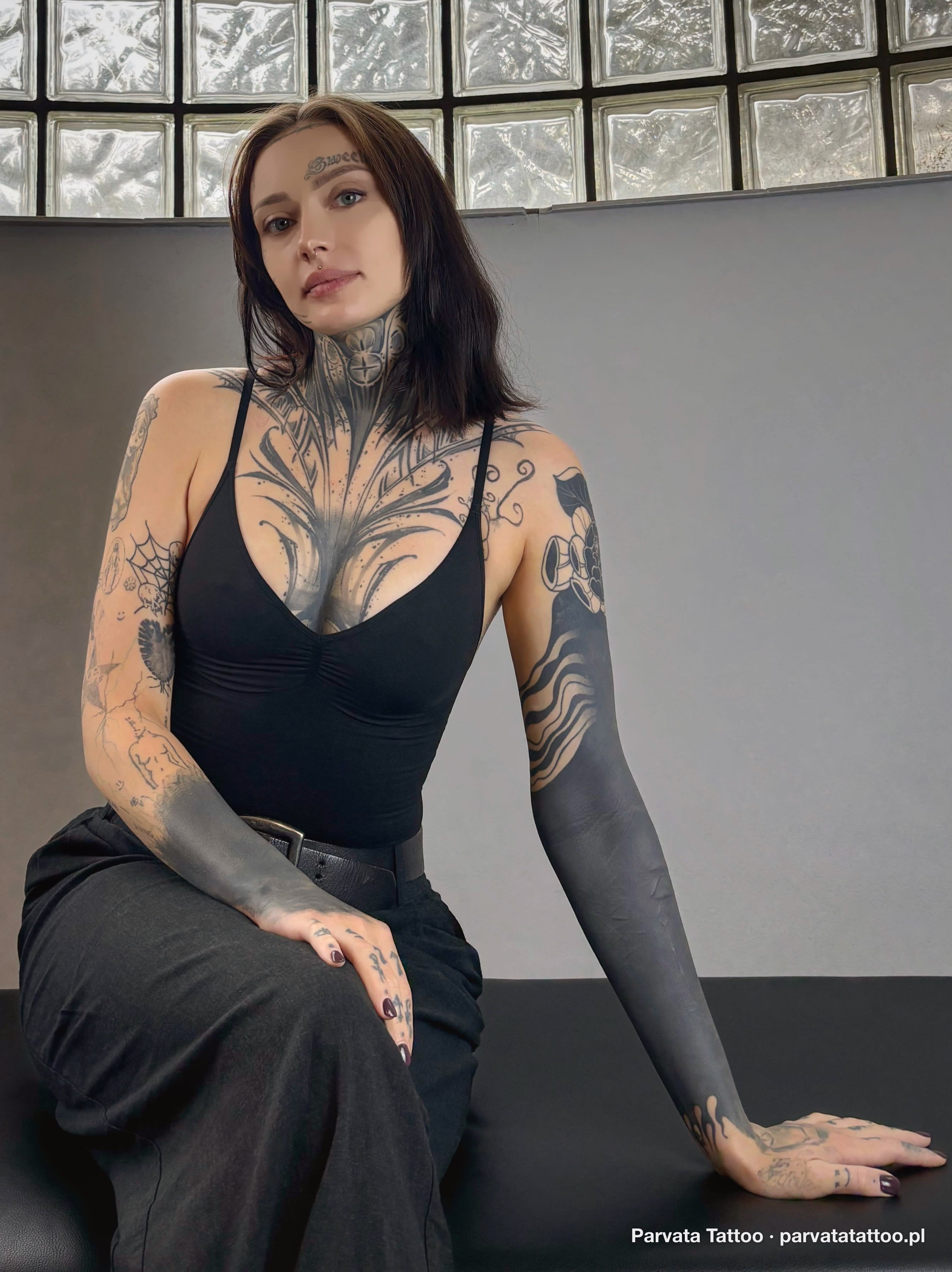
Contemporary neotribal is precise, dense blackwork designed for the muscles of a specific body — closer to architecture than to the old squiggles. Polynesian patterns carry a real grammar of symbols: waves mean journey, shark teeth protection, enata — a person and their relations. A well-designed Polynesian band on the arm tells its owner’s biography, not just decorates.
A note on cultural respect: we don’t copy sacred Māori moko patterns, which record a specific person’s lineage. We draw on the language of forms and build compositions original to you. We explain the difference at the consultation — it’s craft, not etiquette.
Preparing for a session — a checklist that actually works
A week before: skip the solarium and heavy sunbathing on the area going under the needle — sunburnt skin takes pigment worse and hurts more. If you take blood thinners, tell us in advance.
The day before: no alcohol. This isn’t moralising — alcohol thins the blood, increases bleeding and genuinely worsens pigment settling. Sleep well; a tired body handles long sessions worse.
On the day: eat a solid meal no more than two hours before the visit and bring something sweet for longer sittings — a sugar dip, not pain, is the most common reason people feel faint in the chair. Dress comfortably and so the worked area is accessible without undressing entirely: forearm — a T-shirt; calf — loose shorts.
Plan a calm evening afterwards. Fresh work is a micro-trauma — your body will want rest, and it’s wise to let it have it.
A healed piece and real life: pool, sauna, sea, gym without limits
Full healing — the 4–6 weeks we describe above — is the moment all restrictions disappear. Pool, sea, sauna, sunbed (with SPF!), barbell: a healed graphic is part of your skin and tolerates exactly what it does.
The one lifelong habit is sun protection. UV breaks pigment down — slowly but relentlessly — so SPF 30–50 on exposed work in summer is the difference between a design that looks fresh after a decade and one needing a refresh after five seasons.
Bulking or cutting? Moderate physique changes don’t affect a well-designed piece — skin is elastic. Extreme weight swings can distort designs on the stomach and sides; on a biceps or calf the effect is minimal. Planning a big transformation? Just say so at the design stage — we’ll choose a placement and composition more resistant to change.
2026 trends in men’s projects — what we see in the calendar
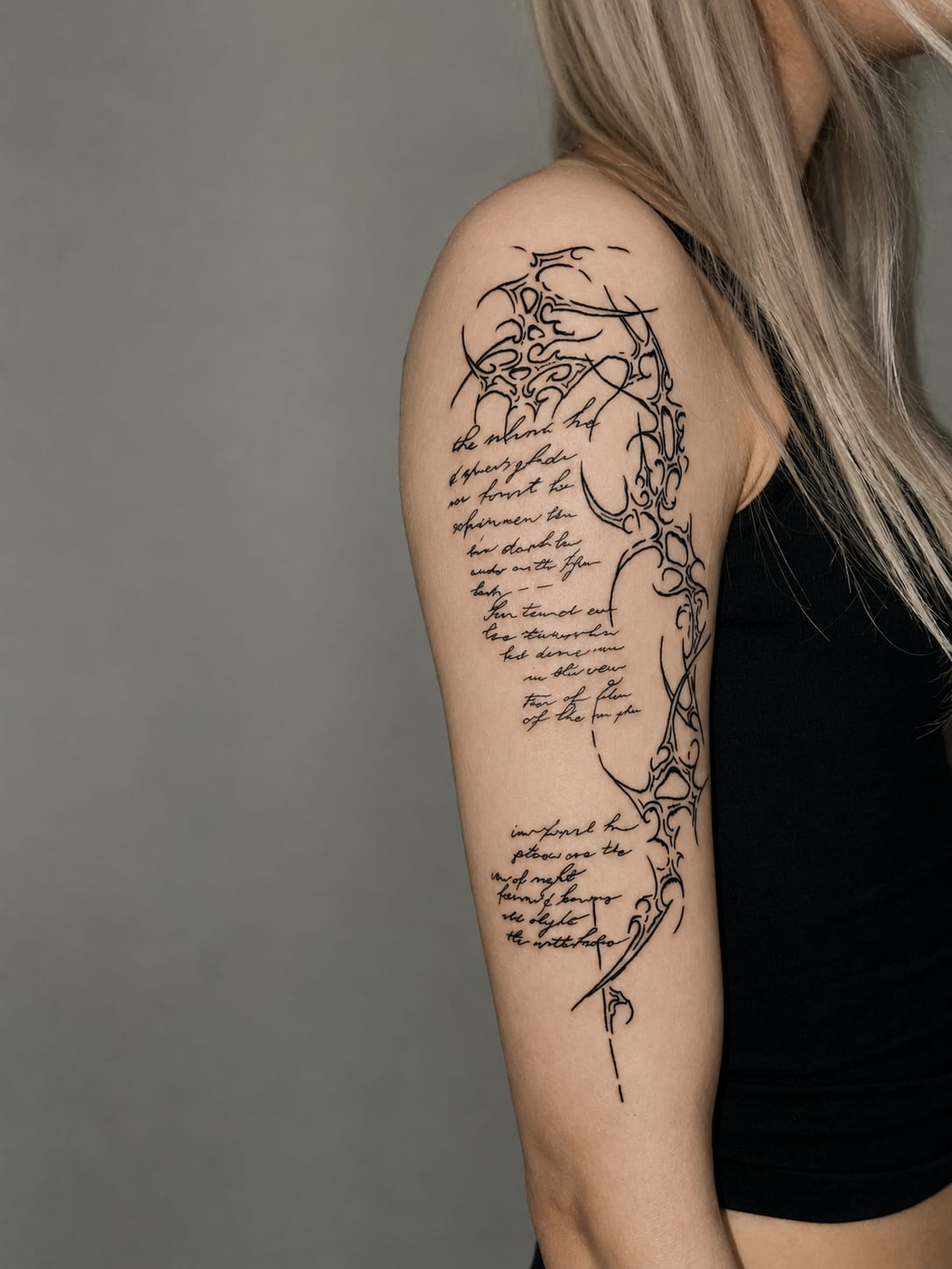
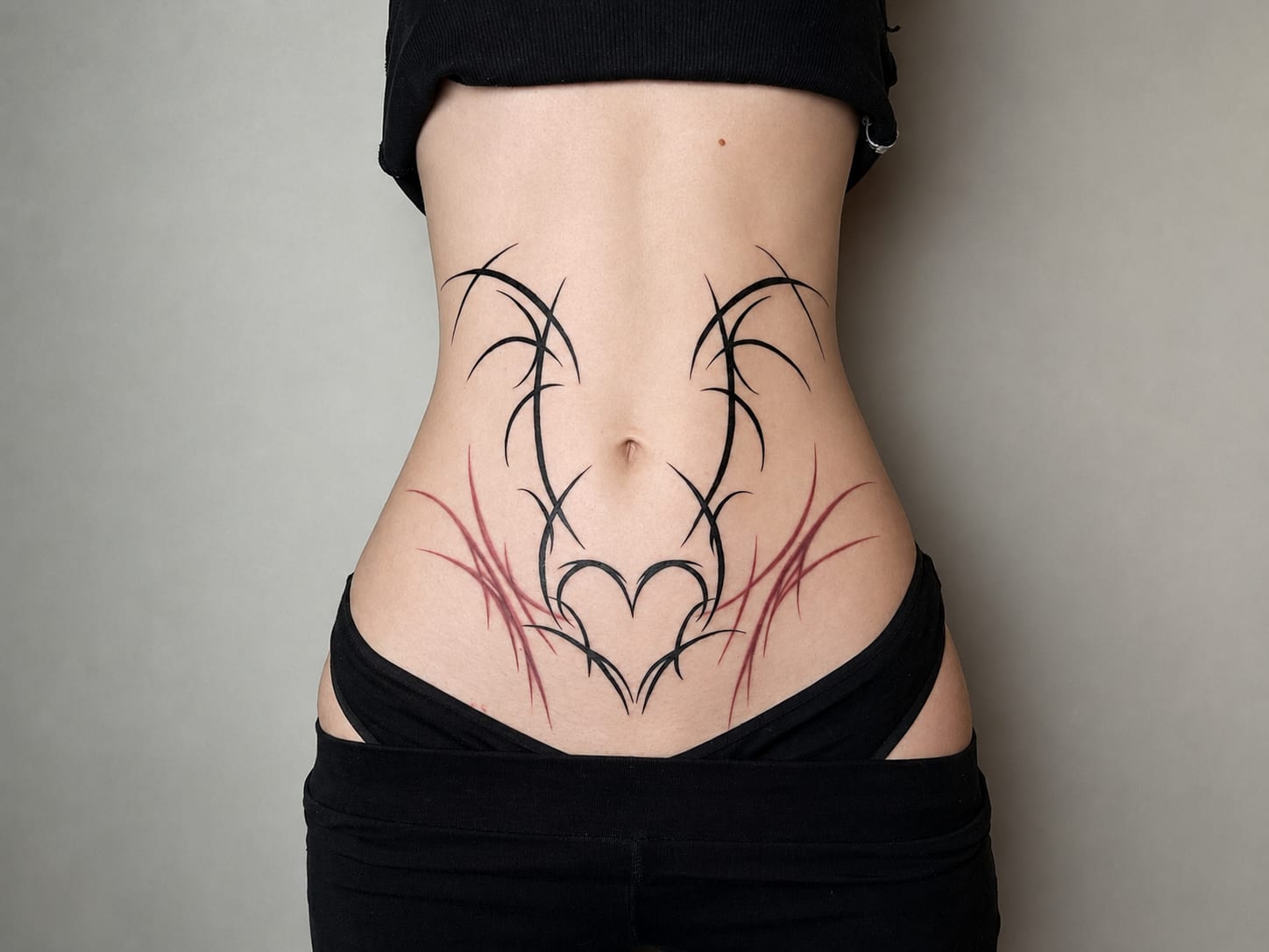
Cyber sigilism and sharp neo-tribal forms are peaking among clients under thirty — slender, aggressive lines inspired by y2k aesthetics. Striking projects, though we’ll say it honestly: this is the most datable trend of the decade, and in ten years it will timestamp its generation the way tribal timestamps the nineties.
Steadily growing, meanwhile, are the timeless currents: precise dotwork and architecture-inspired ornament, large graphic animals in black, Norse mythology in illustrative form rather than literal runes, and sketch style — a sketchbook’s energy carried onto skin one-to-one.
The most interesting trend we observe isn’t aesthetic but attitudinal: men increasingly arrive with a story to tell rather than a picture to copy. The project starts with “what should this say” instead of “what should this look like” — and such pieces win every test of time, whatever the convention.
Geometry, dotwork, biomechanics — conventions for analytical minds
There’s a type of client allergic to the word “symbolism” who lights up at “grid”, “symmetry” and “precision”. Three related languages exist for him. Geometry works with pure form: platonic solids, interlocking circles, compass-built mandalas. Its strength is timelessness — the triangle can’t go out of fashion, never having been in it.
Dotwork builds the image from thousands of individual points instead of continuous line. The effect recalls an engraving: soft tonal transitions without grey washes, a texture you want to touch. It’s time-consuming — expect longer sessions — but it ages with exceptional dignity, because single points have no contours to blur.
Biomechanics is the most engineer-minded current: pistons, cables and chrome showing through torn skin, as if a machine worked underneath. It demands realist skill and good muscle planning — the mechanism must “work” with the arm’s movement. On a forearm or calf the effect is electrifying.
Beard, body hair and shaving — the questions nobody asks out loud
Starting with the session: we shave the area on site with a single-use razor — that’s standard, and you needn’t do anything beforehand. Shaving yourself the day before can actually be a problem, as micro-cuts can exclude a patch of skin from the session.
After healing, hair grows back exactly as before — pigment sits deeper than the follicles and doesn’t conflict with them. Dense hair on forearms or calves slightly mutes fine detail, so on very hairy areas we design with bolder, higher-contrast linework or suggest regular trimming — your choice entirely.
Beards? Neck pieces below the beard line are an increasingly common commission. The rule is simple: we design with margin, accounting for where stubble ends at different lengths. The design looks right with a full beard and clean-shaven alike.
How to read an artist’s portfolio — a user manual
Choosing the artist is eighty percent of the outcome, and the portfolio is their CV. You just need to know where to look. First: photos of healed work, not only fresh. Fresh ink always looks juicy; the truth about craft is told by skin a year on. A studio that shows healed results has nothing to hide.
Second: consistency in the style you want. One brilliant realistic portrait in a sea of random commissions is not enough — find an artist for whom your convention is daily bread. That’s why every member of our team has a clearly described specialisation; not everyone does everything, and that’s a feature.
Third, technical detail: are lines confident and even along their whole length, are blacks saturated without patching, are tonal transitions in realism smooth. And fourth — look at compositions on bodies, not on paper: a good artist shows work photographed on whole body sections, because they design for anatomy, not for an Instagram crop.
Laser removal — when undoing beats covering
We discussed cover-ups, but an honest guide must mention the other road. Sometimes the old work is too dark, too extensive, or placed where a new design can’t digest it — then the sensible option is laser: breaking the pigment with light pulses and letting the body clear it.
Reality without laser-clinic marketing: full removal usually takes 6–12 treatments at 6–8 week intervals, costs run into thousands, and effectiveness varies a lot by colour (black responds best; greens and blues resist). More often than full removal we recommend 2–3 lightening treatments before a cover-up — the old work fades just enough to give the new design full freedom instead of a fight with a dark foundation.
Considering this path? Come to us first with what you carry: we’ll assess honestly whether a well-designed cover will do (faster, cheaper, new artwork immediately) or whether lightening is worth the investment. We do sometimes send a client to the laser — and prefer that to promising a cover that won’t work.
Frequently asked questions
In our studio blackwork and realism lead, with geometry and Norse motifs right behind. We advise against choosing by fashion, though: a trend lasts two years, work on skin — a lifetime. A better filter than “trending” is “mine”.
With us a small design starts at 400 zł, a mid-sized project runs 500–1000 zł, and a large custom graphic 1000–2000 zł per session. Sleeves and back pieces are priced in stages. The price includes an individual design and a free touch-up after healing.
We most often recommend the outer forearm or the calf: moderate pain, a good surface for composition, and easy covering when needed. We avoid starting with ribs, hands or neck — those zones are for the committed.
For the first 7–10 days skip exercises engaging the tattooed area — the issues are friction, stretching fresh skin and equipment hygiene. Then return gradually. A healed piece is completely indifferent to training.
Apply the time test: if the motif already meant something to you five years ago, it will likely survive the next fifty. Avoid internet copies, fresh trends and partners’ names early in a relationship. And give yourself at least a month between idea and booking.
It hurts longer, not harder — intensity depends on placement, not scale. We split large projects into sessions with healing breaks, so the discomfort spreads over time. The most demanding zones are ribs, sternum and inner biceps.
We refresh or cover only fully healed skin — at least 6–8 weeks after the last work. Old pieces don’t need laser removal before covering: a good rework design uses them as its foundation.
No — debutants 30+ and 40+ are a large share of our clients. Skin takes pigment without complaint, and mature decisions end up on cover-up lists least often. The only difference: healing may take a few days longer than at twenty.