


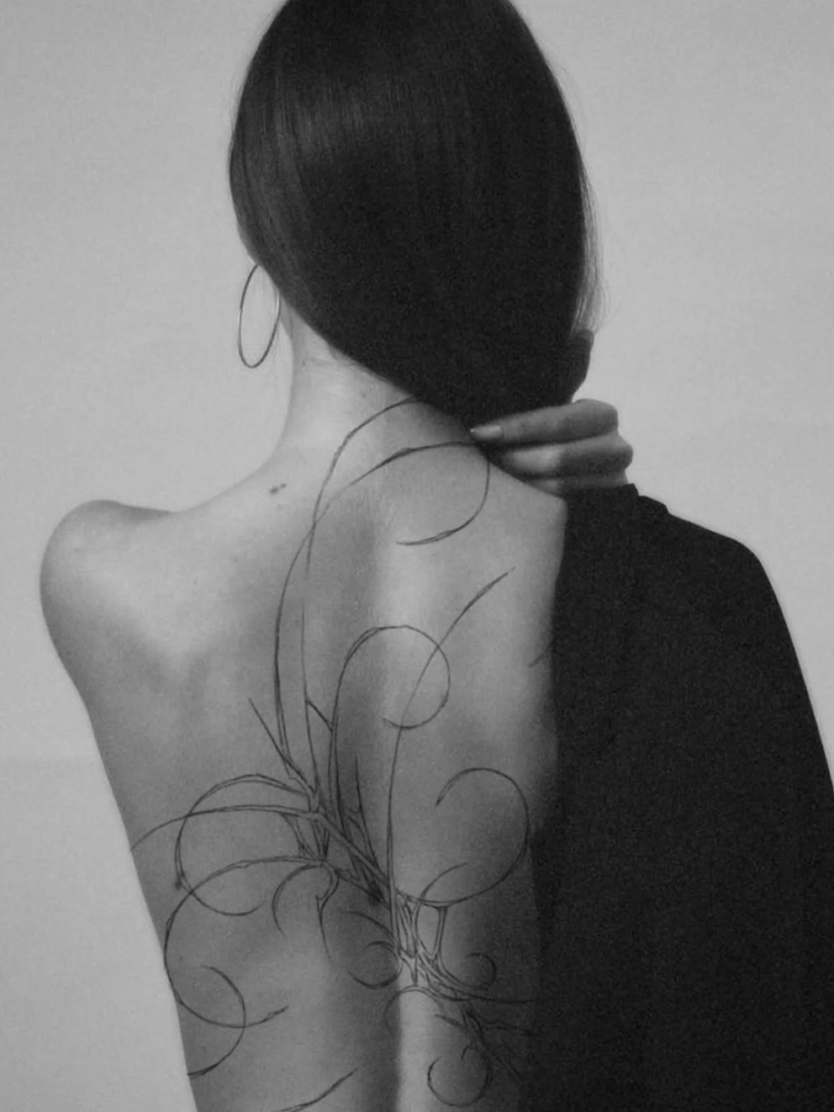
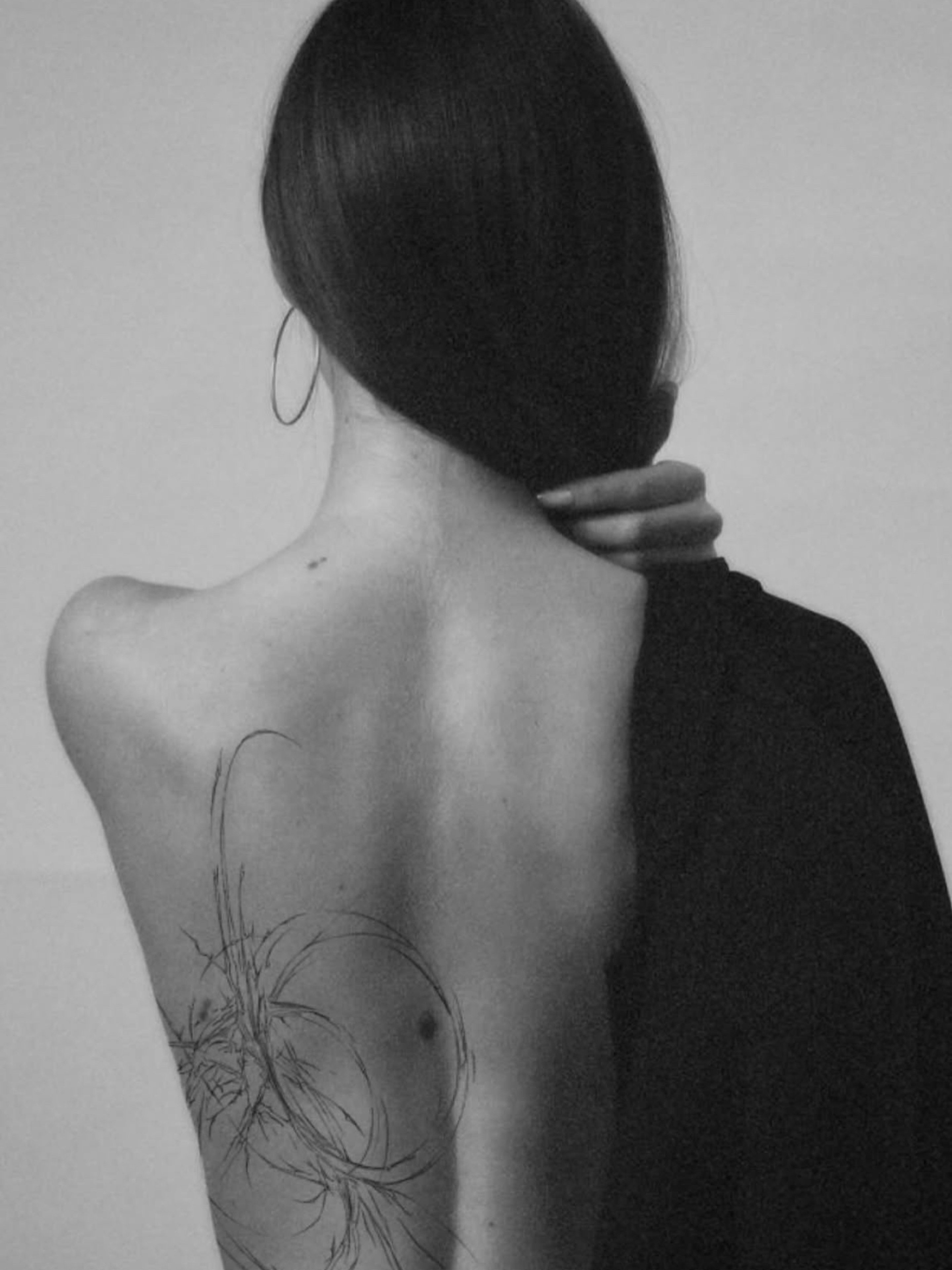


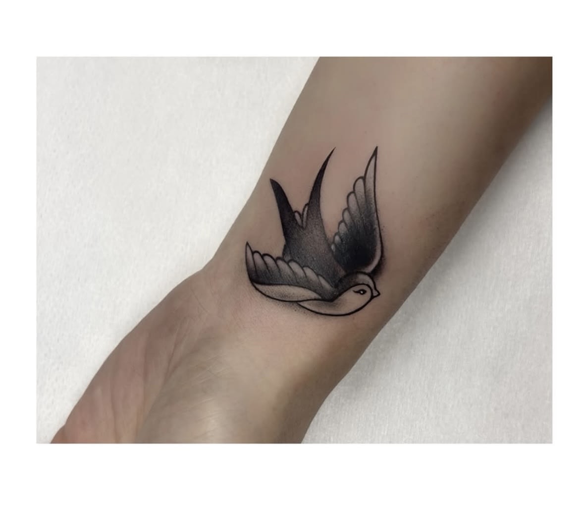
Cover-up — a second life for your tattoo
We cover old or unloved tattoos with a new design. See before-and-after transformations straight from our studio.
Tattoo styles
Lettering is tattoos made of letters: quotes, names, dates and calligraphic compositions. We choose the typography, size and placement so the text stays legible for years.
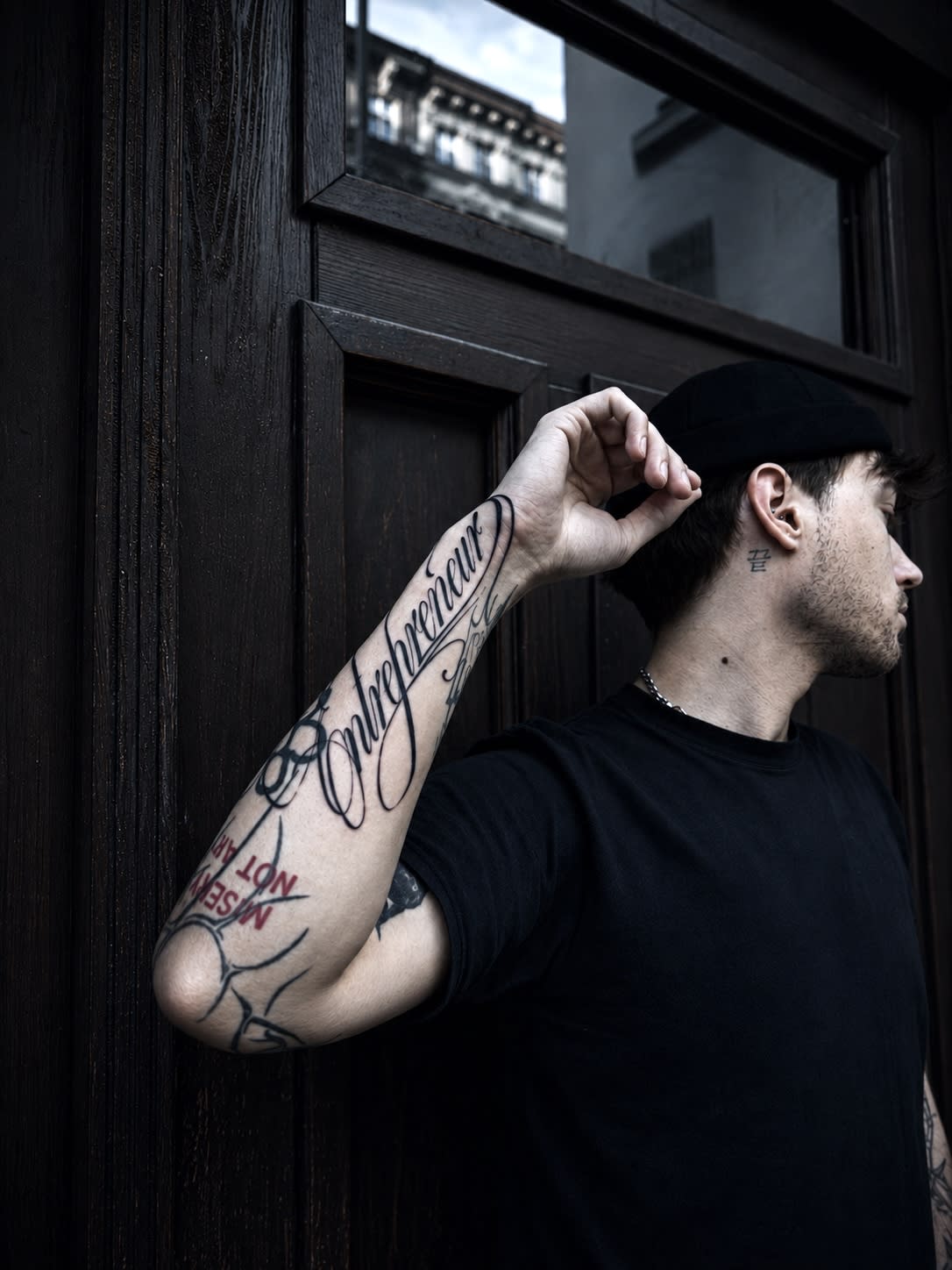
A word is one of the most personal tattoos you can wear: a quote that changed something in you, the name of someone close, a date, a motto. Lettering translates these words into a graphic form — and the difference between an off-the-machine inscription and good lettering is like the difference between a word-processor font and a letterer's design.
At our studio in Wrocław we treat lettering as a full-fledged graphic project: we match the typeface to the character of the words, compose the text with the anatomy of the placement and watch over the parameters that determine legibility over the years. On this page you'll find everything worth knowing before you tattoo your words — from choosing a letter style to the rules of aftercare.
Below we take lettering apart: the history of letter styles, the rules of legibility over the years, the session, handwriting and number tattoos — and answers to the questions we hear most often about inscriptions.
Lettering is designing the inscription as a unique composition — letter by letter, taking into account how the text will sit on a specific part of the body. A ready computer font can be a starting point, but a good tattoo artist always adapts it: adjusting spacing (kerning), stroke weights and connections so the text flows rather than looking like a printout stuck onto the skin.
Language and correctness also matter: we check spelling, grammar and diacritics — including in foreign languages. A tattoo can't be fixed with the backspace key, so verifying the text is a permanent part of our process before every lettering session.

The letterform gives the words their tone. The most frequently chosen directions are:

Letters are the most demanding test of a tattoo's durability — too small or too dense, they merge over time. The rule is simple: the more ornate the typeface, the larger the letters have to be. For simple fonts, a safe height starts at around 5 mm; for calligraphy and Gothic — clearly more.
Inscriptions sit best along the body's natural lines: the forearm (a classic for quotes), collarbone, ribs, spine, wrist or the back of the arm. We design longer texts in lines or an arc, so they can be read without turning your head. We advise against fingers and the inside of the hand — letters blur there fastest.

The most emotionally lasting inscriptions are those whose meaning is independent of fashion: children's and loved ones' names, dates, short personal mottos. With quotes in foreign languages — Latin, English, Italian — it's always worth double-checking the spelling and meaning; we'll gladly help verify the source before the session.
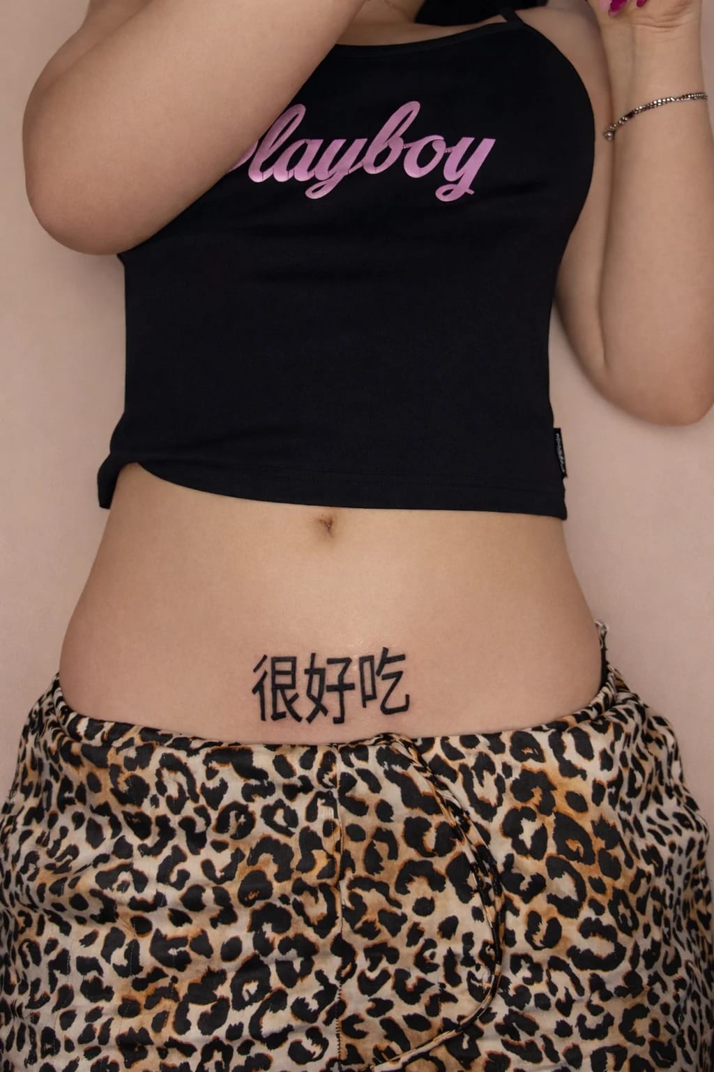
Inscriptions in non-Latin alphabets are also popular: Hebrew, Arabic, Japanese. Here the principle of limited trust applies doubly — the translation must come from a reliable source, because an error in a foreign script is invisible to the wearer but obvious to a native speaker.
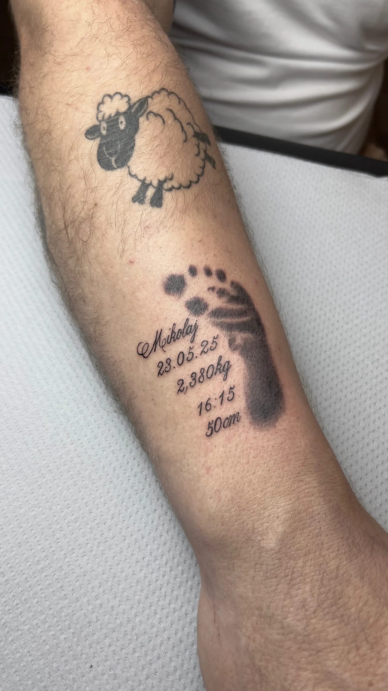
We start with the text and the emotion it's meant to carry. On this basis the artist proposes 2–3 typographic directions and a composition fitted to the chosen placement. You approve the design before the session — in exactly the size it will be tattooed, so you see the real effect, not a scaled-down preview.
The session itself, for short inscriptions, usually takes up to an hour. Precision is everything here: an even rhythm of letters, a stable line, consistent weights. We work slowly and cleanly, on sterile single-use equipment — and after the session you get clear aftercare instructions.
Fresh lettering is cared for like any linework tattoo: gentle washing, a thin layer of ointment, loose clothing, no pool or sun during healing. You'll find a full step-by-step guide in our article on fresh tattoo aftercare — and with inscriptions it's especially important not to pick at scabs, because a gap in a letter shows immediately.
Years later the letters may slightly lose contrast — that's natural. A short refresh session restores their full black and sharpness. If you wear an inscription you no longer want, also check our Cover Up page: letters can be skilfully covered with a new design.

Words on skin are as old as tattooing itself, but lettering as a separate art was born in a specific place: the chicano culture of the American West Coast. There, in the forties and fifties, a distinctive language of ornate calligraphic letters emerged — a needle-written manifesto of identity, family and loyalty.
Other traditions grew in parallel: old-school sailor inscriptions in simple, legible type, gothic blackletter of European ports, and later graffiti typography, which brought street energy and formal experiment. Modern lettering draws on all these sources at once — and adds the craft of digital typography: today's letter designer understands the spaces between characters, the rhythm of a line and the optical illusions that make an inscription read well from any distance.
At our studio we treat this tradition as a toolbox: ornament from chicano, legibility from old school, fluid gesture from calligraphy — proportioned to your words, their meaning and the placement.

Lettering is one of the gentler experiences: linear work without large fills, and most inscriptions close in one session of thirty minutes to two hours. Discomfort depends mostly on placement — the forearm is calm territory, ribs and feet ask for more character.
What is unusual is the time proportion: with lettering the preparation stage is often longer than the tattooing itself. Before the machine starts, the letters must be perfectly laid out — we check the vertical, the horizontal, the spaces between characters and how the inscription behaves in the body's natural position.
Tattooing letters is surgical work: the line must keep an even weight along its whole length, arcs must be fluid, endings clean — so we work slowly. After the session you get a second-skin dressing; lettering usually heals fast and uneventfully.
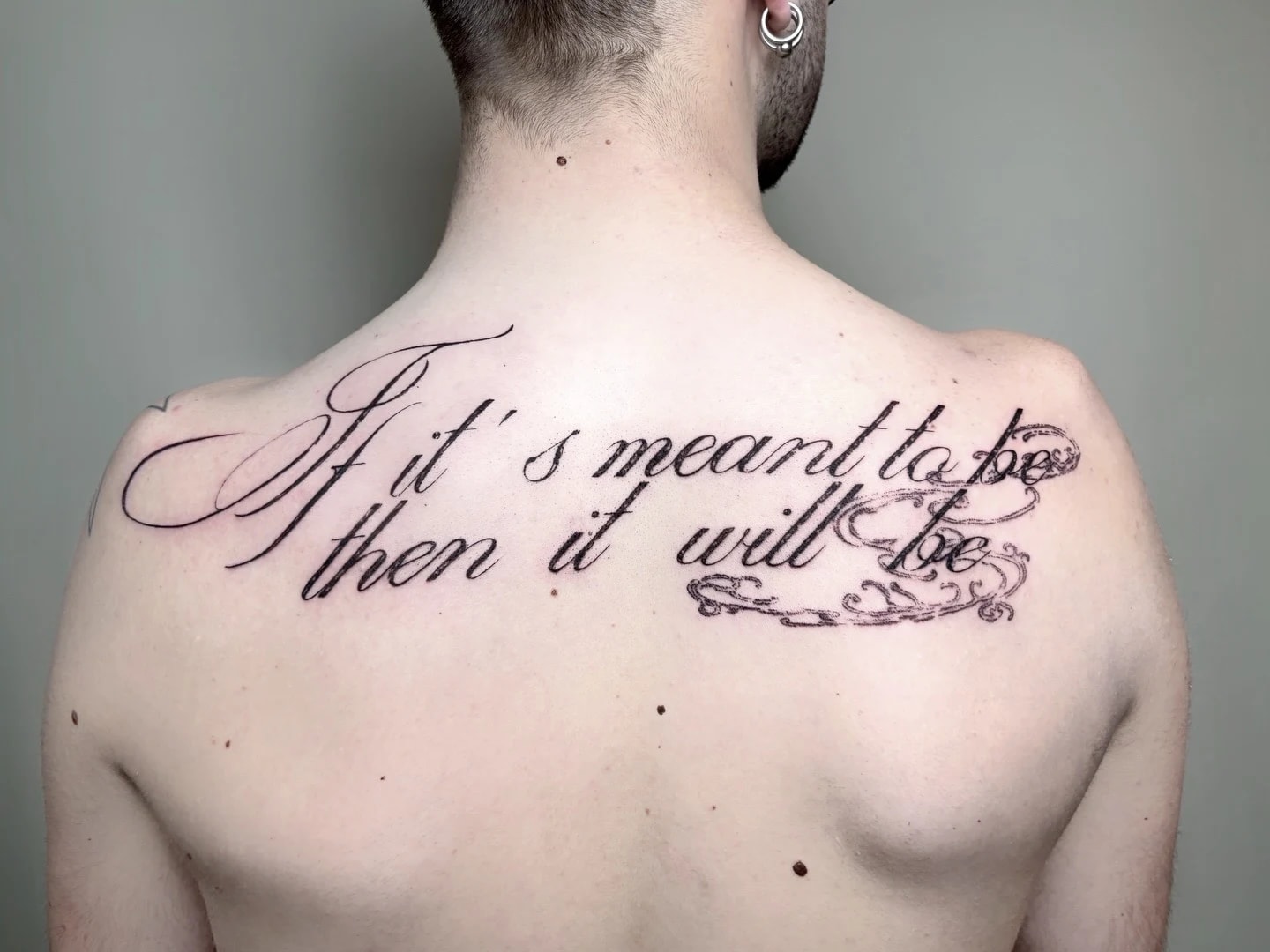
The first story is keepers of words: people who have carried a sentence for years — a book quote, a loved one's words, a motto that got them through a hard time. For them lettering is the natural choice: the meaning already exists; our work is only to give it a worthy form.
The second story is commemorators: children's names, wedding and birth dates, dedications to those who passed — the most personal lettering commissions, where we double-check every detail from spelling to the dot over the i. The third story is typography aesthetes: people who love letters as form — calligraphy, blackletter, minimalist sans-serifs — whose inscriptions are short but polished like a logotype.
All three share one thing: words on skin must be flawless, linguistically and typographically. We take responsibility for both at the design stage. Send your sentence, name or date through the form along with the story behind it — typeface selection starts from meaning, not a font catalogue.
There is a category of lettering no typographer can design: the handwriting of someone close. A dedication from a book from mum, grandfather's signature from a postcard, an „I love you” from a letter — transferred to skin stroke by stroke, with every loop and imperfection that makes it real.
Technically it is demanding: handwriting has uneven line weight, accidental spacing and tiny details that must be kept while ensuring the tattoo's durability. Sometimes we gently correct size or spacing — always so the character of the writing stays untouched.
The best source material is a scan or a sharp photo of the original in natural light — though we have reconstructed inscriptions from materials in truly varied condition. These are the most moving commissions that reach our stations, and we treat them with matching care; you approve the design before the session, character by character.
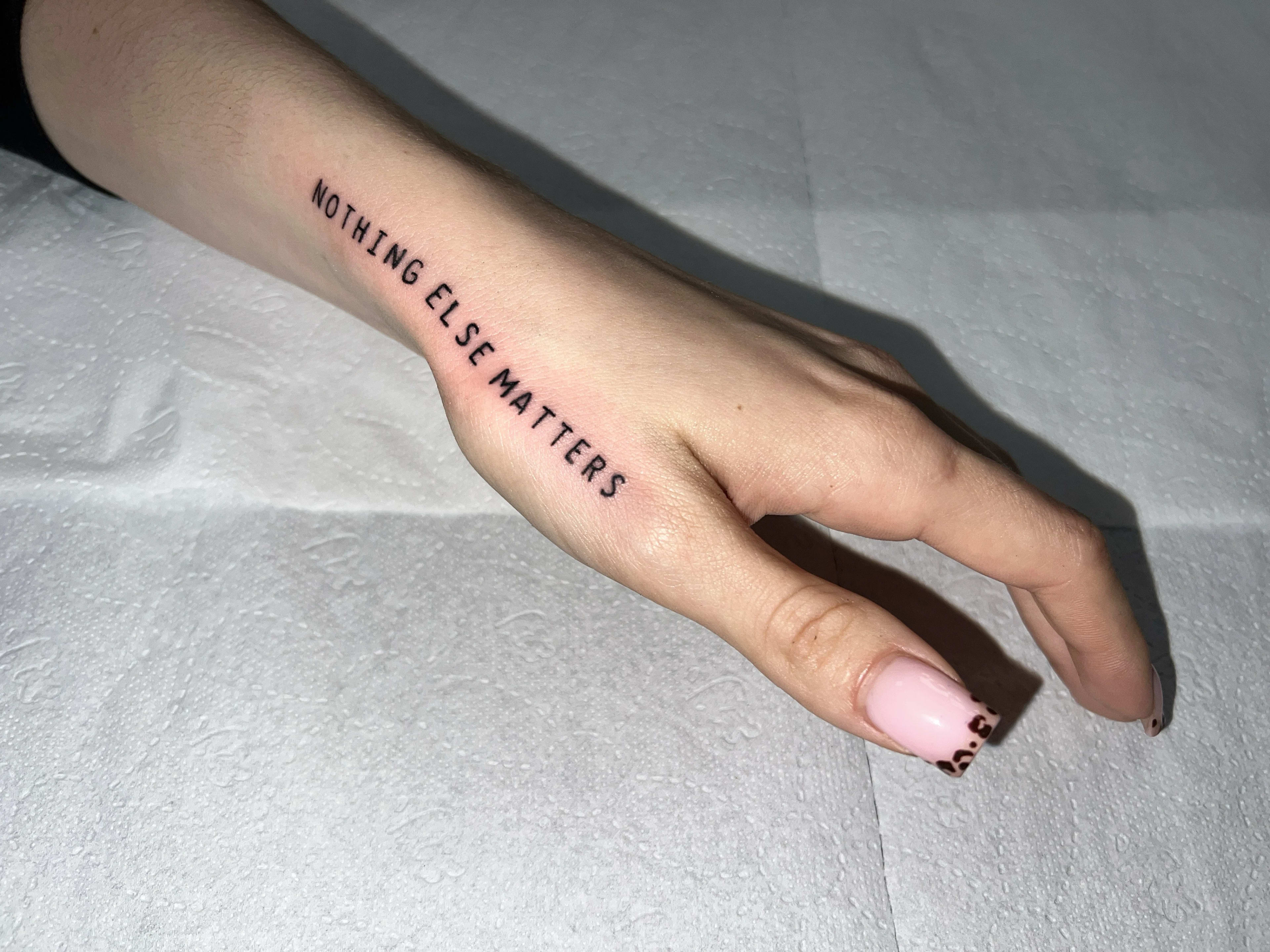
Myth one: „an inscription is the simplest tattoo, anyone can do it”. Letters are merciless: everyone knows what a correct „a” looks like, so every deviation shows instantly. In a graphic motif a small asymmetry can be charm — in a letter it is an error. That is why lettering is a specialisation, not an add-on.
Myth two: „the more ornate the typeface, the more beautiful the result”. Ornament has its price: the more flourishes, the larger the inscription must be to stay readable over the years. Sometimes the most beautiful choice is a simple, elegant typeface — sometimes blackletter, just one size larger than you assumed. We will honestly show both variants.
Myth three: „foreign-language inscriptions are asking for a blunder”. Blunders come from lack of verification, not from the language. Every foreign inscription passes a spelling and meaning check before the session — and for non-Latin scripts we additionally ask for a source you trust.
A separate branch of lettering is numbers: birth and wedding dates, the hours of important moments, coordinates of places, Roman numerals of pivotal years. It is the most disciplined form of inscription — zero narrative ornament, pure information whose power lies in private meaning.
Numbers have their own typographic laws: Roman numerals build a beautiful rhythm of vertical and diagonal strokes, but longer dates grow into a chain that must be broken wisely; Arabic digits are concise but need careful typeface selection so a zero does not blur with the letter O over the years.
Geographic coordinates — a keepsake of where you met, the family home, a summit — we usually design as one discreet line along the forearm or collarbone. We always double-check them on a map before the session: a comma in the wrong place is a different country. If your story is written in numbers — send them through the form with the context; the form that carries them is our job.
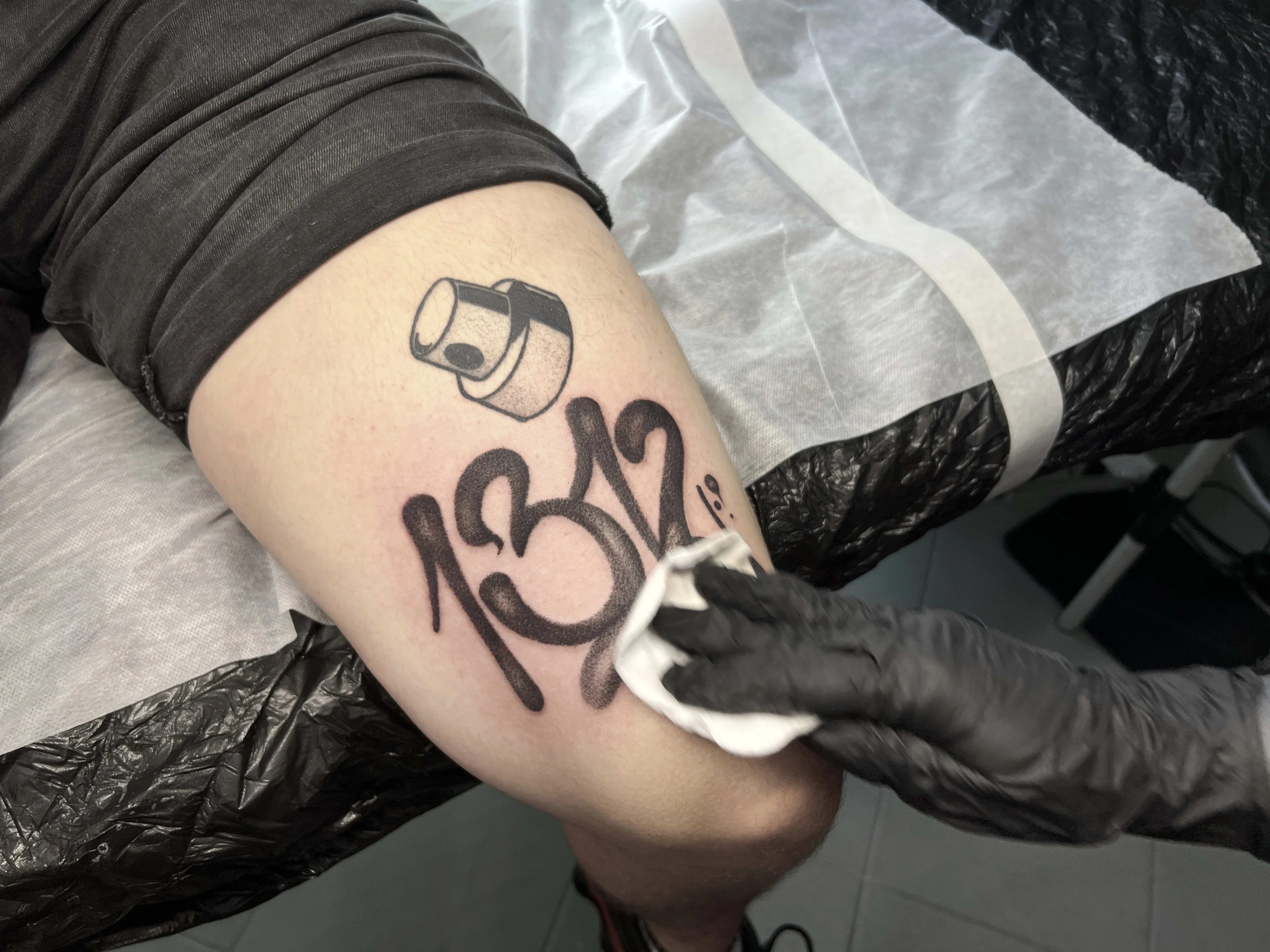
Choose lettering when words mean more to you than an image — a name, a date, a line, or someone's handwriting. We draw the letterforms from scratch, not from a ready-made font.
We will not go smaller than legibility allows — letters have to survive years, not just the photo taken after the session. For foreign languages we ask for a verified source for the spelling.
For simple typefaces the minimum safe letter height is around 5 mm; ornamental and calligraphic faces need a larger scale. On the 1:1 design we show how the piece will really look and tell you honestly if it needs to be bigger.
Yes — we always verify spelling, grammar and diacritics, including in foreign languages. For text in foreign alphabets we ask for a trustworthy source of the translation and help verify it before the session. Final confirmation of the wording is, however, the client's responsibility.
The classic placements are the forearm, collarbone, ribs, spine and the back of the arm — there the text follows the natural lines of the body. We advise against fingers and the inside of the hand, where letters lose readability fastest.
Yes — a script often completes a composition: a fine-line branch, a small ornament or a minimalist symbol. Whole calligraphic compositions are possible too. In the consultation we advise what will work with your text and the picture in your head.
The quote depends on the length of the text, the typeface and the placement. Short pieces are usually a session around the studio minimum — in our case 400 zł. Send the text and your idea through the form and we will give you a specific quote.
Usually yes. The options are refreshing the letters, redrawing the text in a stronger typeface or a cover-up with a new motif — see our Cover Up page and send a photo, we will assess the options free of charge.
Yes — those are some of our favourite commissions. A scan or a sharp photo of the original is enough; we transfer the character of the writing stroke by stroke, adjusting at most the size and spacing for durability. You approve the design before the session, character by character.
Send the wording, the story behind it and your preferred placement through the form. We will propose typefaces matched to the meaning, and during the free consultation we try the size and position on your body — only then do we book the session.
Yes — as standard we prepare two or three typographic proposals matched to the meaning and the placement, with a one-to-one size preview. You choose calmly, with no pressure; only the approved variant goes on skin.
Often — blurred letters can be re-saturated and sharpened, a crooked line can be balanced compositionally, and hopeless cases can be elegantly covered. Send a photo through the form and we will tell you honestly which option makes sense.
Yes — a short session, line work with no filling and gentle healing make a script a very accessible debut. An extra advantage: the meaning is already settled, so the whole design conversation focuses on form — the typeface, the size and the placement that will carry your words for decades.
It can — those are the two most striking lettering layouts, and also the two most demanding to design. The vertical of the spine requires a perfect axis and a letter size matched to the length of the text, while a script wrapping the arm has to keep an even rhythm on a curved surface. We try both variants on the body before the session.
It depends on the goal: a single word works like a sign — strong and immediate, a sentence like a memory you read. The shorter form gives more freedom in typeface and placement; the longer one needs simpler typography and more surface. In the consultation we try both routes on your words.
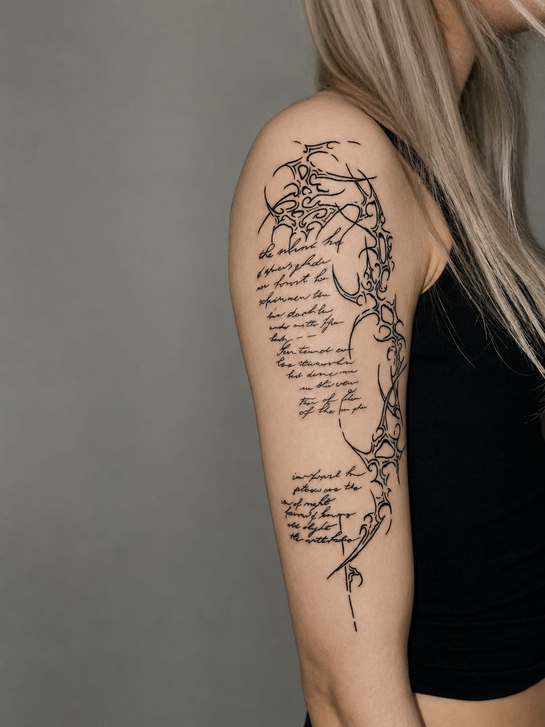
Ciphers of organic calligraphy
Dominika Doroszkiewicz • Technokracja • Tattoo Artist
Forearm Script
Justyna Góra • Tattoo Artist • Permanent Makeup

Unforgettable
Justyna Góra • Tattoo Artist • Permanent Makeup
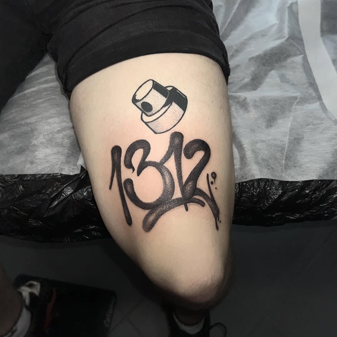
1312 Graffiti
Justyna Góra • Tattoo Artist • Permanent Makeup

Typographic 'Destroy' slogan
Justyna Góra • Tattoo Artist • Permanent Makeup
Asian characters belly ink
Justyna Góra • Tattoo Artist • Permanent Makeup
Indicative ranges — every piece is quoted individually after a free consultation.
Minimalist tattoo
300 PLN
~75 €
A single small motif in a thin line, with no shading or fill — one symbol, a date or a short word. The shortest session on our list.
Get your quoteSmall design
from 400 PLN
~100 €
Small motifs, lettering and single elements with detail or light shading — usually one short session.
Get your quoteMedium project
500–1000 PLN
~125–250 €
Hand-sized compositions: fine line, ornaments, lettering with graphics, smaller shaded motifs.
Get your quoteLarge project
1000–2000 PLN
~250–500 €
Detailed designs on the forearm, calf or back — more detail, often longer or multi-stage work.
Get your quoteSleeves and large pieces
individual quote
Sleeves, large compositions and multi-session projects are billed per session across several appointments.
Get your quoteThe ranges are indicative. The final, binding price is set after the consultation and once the design is approved.
Our artists’ portfolio is the best test of whether a style fits your skin and idea. Filter by style, body placement or tags.
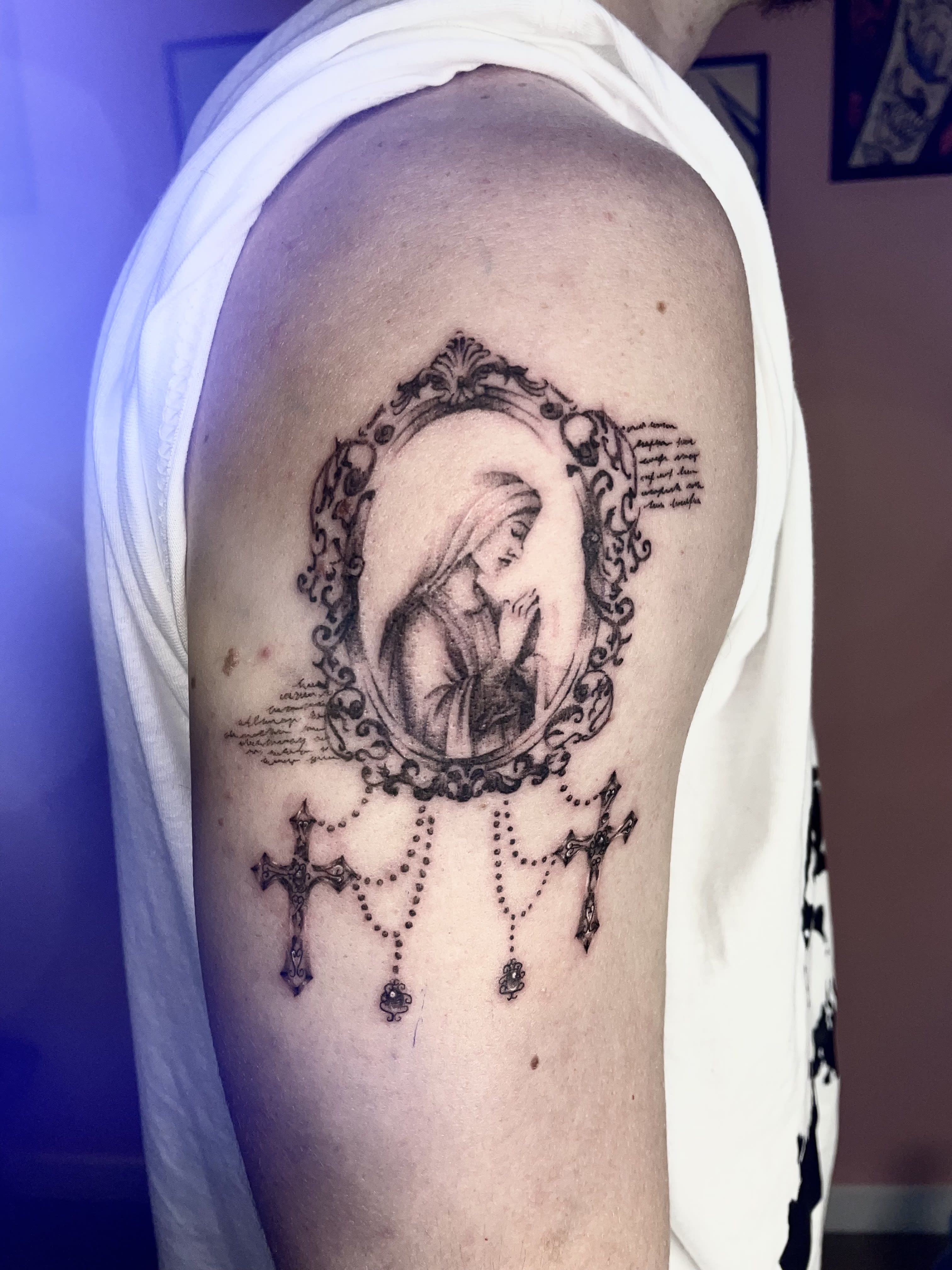

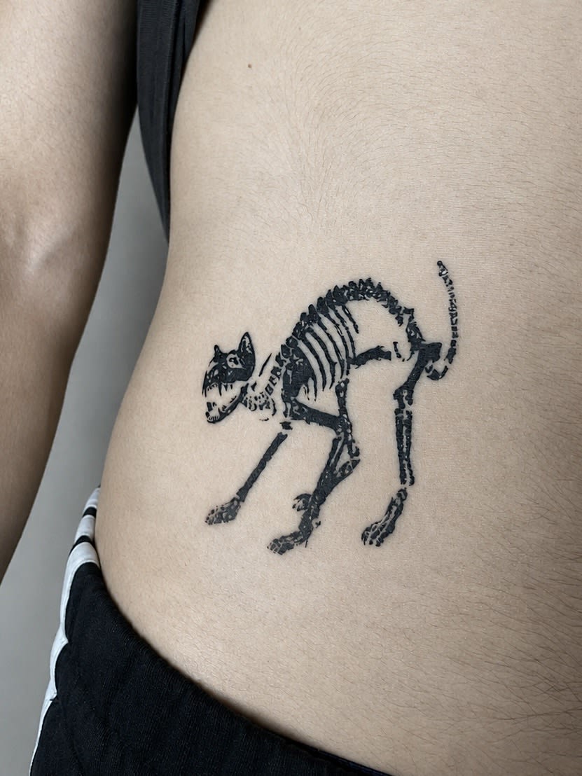
Each artist has their own specialities — see profiles and portfolios, or describe your idea in the form and we’ll match the right person.
The techniques in this gallery have their own pages — motifs, healing, prices and healed examples.
We cover old or unloved tattoos with a new design. See before-and-after transformations straight from our studio.
Practical guides by our artists — pain, aftercare and preparation. No myths, no scare stories.

Original projects waiting for an owner — each with a price and a suggested size.
The questions that matter most
Describe it in the form — we’ll suggest a style, an artist and the nearest date. The consultation and quote are free.